hichahee
Jun 1, 2023
Writing Feedback / The chart illustrates distances traveled per person per week (in kilometers) in terms of 5 types of [2]
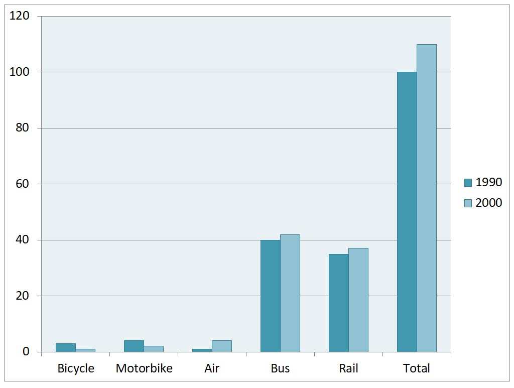
The graph below gives information about the changes in travel habits by mode of transport in the UK from 1990 to 2000.
Overall, there was a decrease in the use of bicycle and motorbike, while the figure for air, bus and railway saw opposite changes, resulting in the rise of the total numbers. In addition, the most common forms of travel were by bus and air.
Looking at the details, the number of bicycles used started at around 5km, before ending the period at just over 1km. Similar changes can be seen in the figure for motorbikes, which fell slightly to about 1km at the end of the period.
Conversely, the usage of air increased marginally from just 1km in 1990 to downward of 6km in 2000. Similar changes, but to a greater extent, can be seen in the figure for bus and air, which grew from precise 40km to slightly upward of 40km and 35km to just over 38km respectively.
travel habits by mode of transport in the UK
The graph below gives information about the changes in travel habits by mode of transport in the UK from 1990 to 2000.
Overall, there was a decrease in the use of bicycle and motorbike, while the figure for air, bus and railway saw opposite changes, resulting in the rise of the total numbers. In addition, the most common forms of travel were by bus and air.
Looking at the details, the number of bicycles used started at around 5km, before ending the period at just over 1km. Similar changes can be seen in the figure for motorbikes, which fell slightly to about 1km at the end of the period.
Conversely, the usage of air increased marginally from just 1km in 1990 to downward of 6km in 2000. Similar changes, but to a greater extent, can be seen in the figure for bus and air, which grew from precise 40km to slightly upward of 40km and 35km to just over 38km respectively.

Screenshot2021051.jpg