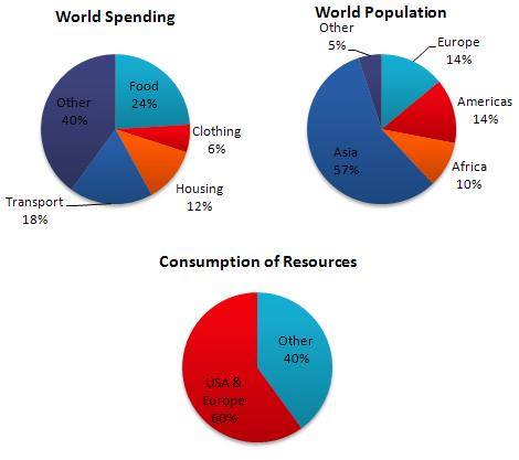
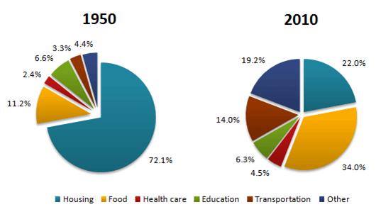
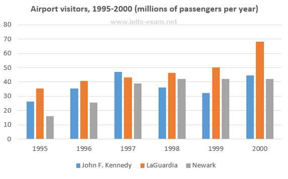
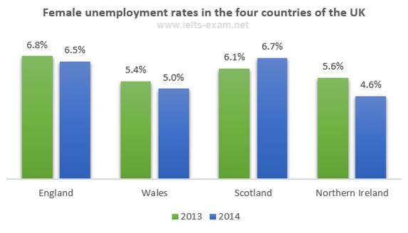
Unanswered [30] | Urgent [0]
  

Posts by Niam01
Name: Ahmad Syamsuri Niam
Joined: Jan 18, 2016
Last Post: Jan 21, 2016
Threads: 6
Posts: 7  
Likes: 2
From: Indonesia
School: Sepuluh Nopember Institut of Technology

Displayed posts: 13
sort: Oldest first   Latest first  | 
Niam01   
Jan 18, 2016
Writing Feedback / IELTS 1 - The bar chart reveals the proportion of succeed competency test of apprentice [2]

The bar chart below shows the percentage of students who passed their high school competency exams, by subject and gender, during the period 2010-2011.

The bar chart reveals the proportion of succeed competency test of apprentice in their secondary school according to syllabus and sexes, between 2010 and 2011. Overall, it is evident that the percentage of female was nearly the most dominant passed in all subjects. While girls clearly had the greatest number in Computer Science, boys experienced in Geography subject.

To begin, the largest proportion of passed examination saw in female with subject computer science at 56.3% compare to male at 42.1%. Furthermore, Mathematics and Foreign Languages had nearly similar rate in both gender of student who passed in competency exam but the girls had higher than boys, at more than two-fifth. Again, in Chemistry girls witnessed two times more than boys in rate of succeed in exam.

On the other hand, Physics showed more than a third succeed test in girls and boys, 36.7% and 34.6% respectively. At 25.6%, female passed in History subject higher percentage than male at 22.9%. Interestingly, boys had greatest number pass examination at Geography subject, Its displayed at 30.4% and girls just a fifth.


Niam01   
Jan 19, 2016
Writing Feedback / [Writing Task1/Pie Chart] World Spending, World population and Consumption of Resources [2]

The pie charts below show World Spending, World population and Consumption of Resources

The Pie charts displays the comparison of resources' consumption, expenditures based on primary needs and distribution of population in the world. Overall, it is important to note that most people of the world live in Asia. The greatest proportion of expenditure is used on foods whereas the majority of resources are consumed by USA and Europe people.

Moving to a more detailed analysis, nearly a quarter of the total world spending is made for foods while expense for clothing is just 6%. Afterwards, the expenditures for housing and transports are respectively twofold and threefold of clothing's spending. Subsequently, more than a half of world people settle in Asia, 14% of world population lives in both Europe & America and only 10 % of them inhabits in Africa.

Moving to consumption of resources, USA and Europe representing 28% of global population consume 60% world resources, whilst 72% of world people use just two-fifths of its resource.


Niam01   
Jan 20, 2016
Writing Feedback / Prediction energy consumption in the USA since 1980 until 2030 [2]

The graph below gives information from Annual Energy Outlook 2008 about consumption of energy in the USA since 1980 with projection until 2030.

The line chart shows the number of forecast consumption energy by six different varieties of fuels in USA based on experience of applying energy in 2008, between 1980 and 2030 and measured by quadrillion units (qu). Overall, it is important to note that Petrol and Oil will be projected as the main sources of energy. Natural Gas and Coal have had the similar number demand of energy whereas Nuclear, Solar and Hydro have been the least energy provider.

To begin, the number energy of Petrol and Oil were stood at 35qu in 1980, which is almost double than two source energy else, Natural Gas at 20qu and coal at 15qu. Despite there was a fluctuation in the beginning, Petrol and Oil experienced a significant increase in their energy and will expected approximately at 49qu in 2030. Followed by Natural Gas and Coal had almost same pattern. Though coal had some fluctuation until 2010 but from then it started to rise and expected to be labeled off and will finish the period at 25qu unit. However, natural gas rose gradually from 1980 and predicted to continue this trend up to 2030 and will exceed the level of 30qu of energy.

On the other hand, Solar/Wind, Nuclear, and Hydropower were the least-used types of energy sources and will remain the same throughout the time period. However, Nuclear and Solar showed a slight increase and will continue to rise slowly until 2030.


Niam01   
Jan 21, 2016
Writing Feedback / A Comparison of Household Expenditures between 1950 and 2010 - the pie charts [3]

However, in sixty years later, housing expenditure FOR HOUSING decreased dramatically to ...
In contras BY CONTRAST, food expenditure FOR FOOD in 1950 was at more than one in ...
NEXT, it was followed by other ...

Those expenditures still remained stable at around less than a fifth, Education . Expenses FOR EDUCATION ROSE from 6.6% to 6.3%, Health ...
Niam01   
Jan 21, 2016
Writing Feedback / A description of the percentage of local spending by a houshold in 1950 and sixty years later [2]

The pie charts below show the average household expenditures in a country in 1950 and 2010

A description of the percentage of local spending government over a 60-year period, between 1950 and 2010 is illustrated in pie chart. Overall, it is evident that, in 1950, housing saw just over seven in ten expenditure. There was a significant increase of spending Food and Transportation, while other expenditure witnessed a reverse.

To begin, in 1950, expenditure of Housing was the highest proportion in the local country, at 72.1%. Following this there was decreased dramatically to only 22% over more than a half century. Food was the second expenditure in early period at around one in ten then the figure increased significantly by more a third in the end of period.

Moving to health care, education, transportation and other were less than 20% expenditure in 1950. However, after 60 years spending of local country changed significantly, transportation rose sharply from 3.3 percent to 14.0 percent. Health care and education experienced a slight rise by 1.8%, astonishingly, other expenditure saw a sudden growth which only 4.4% in 1950 rise to 19.2% in 2010.


Niam01   
Jan 21, 2016
Writing Feedback / Different household spending during 60 years [4]

A comparison of the percentage OF SEVERAL household spending in a country ...
... inevitable that there were A significant change in the percentage ...
While the percentage of housing'S expenditure decreased significantly, food'S spending showed the opposite.

... the percentage of housing'S expenditure showed a dramatic decrease over a 60-year period, IT stood at 72.1% in 1950 and fell extremely BY around a half at TO 22 percent in 2010 which was followed by . FOLLOWING THIS, THE EXPENSE FOR education which decreased slightly at 6.6% to be at 6.3 percent. By contrast, the percentage of food'S spending increased significantly ...

... the percentage of transportation'S expenditure showed a rise around one in ten percent, FROM 3.3% in 1950 to 14 percent in 2010.
Niam01   
Jan 21, 2016
Writing Feedback / Travelers using three major airports in New York City (writing task 1) [2]

The chart below shows the number of travelers using three major airports in New York City between 1995 and 2000

A breakdown of the number of tourist who visit to New York City through three particular airports over a half decade, from 1995 to 2000, measured in million passengers a year is showed in bar chart. Overall, it is important note that there was a dramatic fluctuation in the number of visitor via John F. Kennedy. While both of LaGuardia and Newark experienced upward trend, LaGuardia was the highest visitor in the end of period.

To begin, in 1995, the figure of traveler at John F. Kennedy reached around 28 million passengers followed by a gradual increase by approximately 20 million passengers over 2 years. The number then decreased gradually to just over 30 in 1999 and there was a slight increase by 12 million passengers in 2000. In contrast, Newark airport had the smallest visitor in 1995, at about 15 millions. However, there was a large growth after during three years, at more than 40 millions. Following this the figure remained stable until in the end of period.

On the other hand, LaGuardia started at around 35 million passengers in 1995. Afterward, this trend rose markedly during 4 years at 50 million passengers followed by a dramatic increase in 2000 at less than 70 millions, become the greatest number visitor of three airport others.


Niam01   
Jan 21, 2016
Writing Feedback / Exercise and absenteeism in two departments of a major company [4]

... of employees related to THE exercise and absenteeism in ...
Overall, there are SEVERAL similarities and differences between the two departments engaged in the amount of hours spent FOR exercising each week, while THE majority OF employees did it ...

We IT ALSO can also see BE SEEN that those missing due ...

... between five and ten hours fairly WAS similar in BETWEEN Birmingham and London department...
Niam01   
Jan 21, 2016
Writing Feedback / The average household expenditures in a country in 1950 and 2010 [2]

@yus72, let me give you suggestion

A description of the proportion of the familylocal country expense in region over 12 month in period 1950 and from 2010[coma]from 1950 to 2010, is illustrated in pie chart. Overall, it is important to notice,[delete coma] that housing cost in1950,in 1950, Housing was the highest expenditures ...

On the other handHowever, health care expense was ...

Moving to more detail analyzeanalysis, in 1950, The top rank of average national family expenditure was housing at 72% and there wasa significantfell significant at 22% in 2010. The second rank of the average familycountry expense was food at (...) expenditure household in the overend year period in 2010.

... the Education expense at 6,3%, and was thelowest proportion of household expenditure in all period.
Niam01   
Jan 21, 2016
Writing Feedback / Women unemployment percentage in four countries of the United Kingdom in 2013 and 2014 (IELTS 1) [2]

The graph below shows female unemployment rates in each country of the United Kingdom in 2013 and 2014

A breakdown of the percentage of women who joblessness in particular countries of UK over a 12-month period, between 2013 and 2014,is presented in bar chart. At first glance, it is important to note that, in a year, there was a slight decline in female unemployment. While Scotland experienced a small rise in women who did not get a job, Northern Ireland saw a reverse.

To begin, in 2013, England witnessed the largest proportion of female unemployment, with 6.8%. However, this figure decreased in a year later by 0.3%. In contrast, there was an upward rate of women joblessness in Scotland. Interestingly, only this country which had an increasing percentage of employment women, this figure begins at 6.1% in 2013 and followed by an increase at 6.7% in 2014, the highest proportion of women out of work among four countries.

Moving to Wales and Northern Ireland, there were almost a near similar number of women occupied, at 5.4% and 5.6% respectively. Wales witnessed the smallest number women occupied of four countries in 2013 then this figure declined to 5.0% in 2014. Furthermore, there was a dramatic fall in Northern Ireland and become the least percentage of women occupied in 2014, declined by 1%.


Niam01   
Jan 21, 2016
Writing Feedback / A Breakdown of Household Consumption [2]

@desgit33 let me give feedback your writing

A breakdown of the proportion of the average of household consumptionspending local country in 1950 and 2010 is presented in pie charts. At first glance, the highest number of homely activityexpenditure were housing and ...

... as the subject of household activity [coma]need S,V .

... was the biggest number of household consumptionexpenditure .

However, 1950 [coma]consumedexpenses three times more housing than 2010.

However, education was consumed expenses in 2010 smaller than ...
Writing
Editing Help?
Fill in one of the forms below to get professional help with your assignments:

Graduate Writing / Editing:
GraduateWriter form ◳

Best Essay Service:
CustomPapers form ◳

Excellence in Editing:
Rose Editing ◳

AI-Paper Rewriting:
Robot Rewrite ◳