Unanswered [9] | Urgent [0]
  

Home / Writing Feedback   % width Posts: 3


Writing #1: The graph gives information about male and female gym membership between 1980 and 2010


yiwenwen 1 / -  
Jun 15, 2021   #1

gym membership


(The graph gives information about male and female gym membership between 1980 and 2010. Summarise the information by selecting and reporting the main features, and make comparisons where relevant.)

The line chart describes male and female gym membership over 30 years. In this period, both genders underwent several drastic changes.

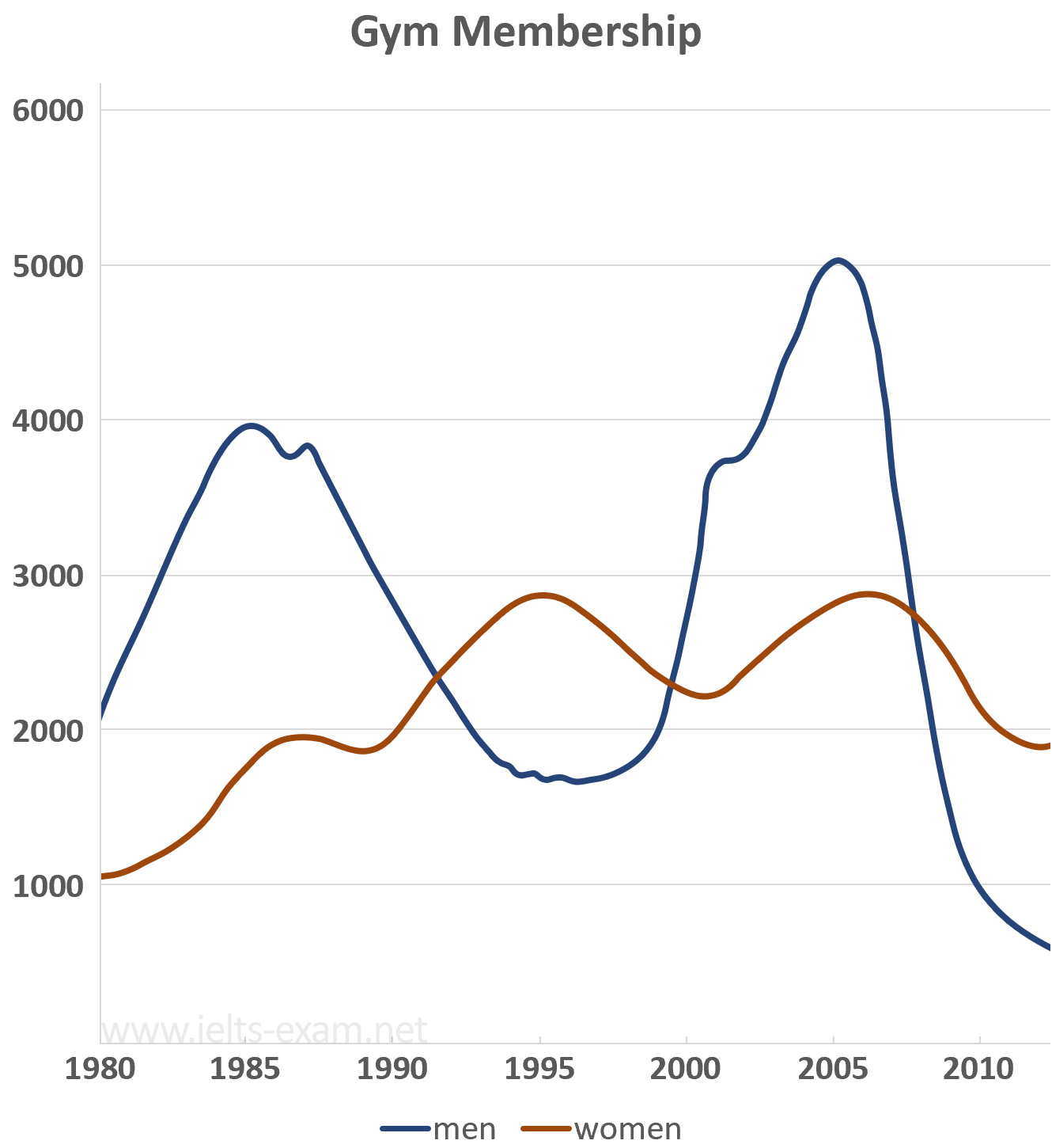
In 1980, the number of men holding gym membership was around 2000, two times higher than women. For the next ten years, the same trend continued. However, the rise and fall of male gym membership were dramatic in this period. It reached a peak at almost 4000 in 1985 and encountered a sharp decline afterward. As for female membership, it experienced a fluctuation between 1980 and 1900. Yet, generally speaking, the growth of women holding gym membership was evident. From 1900 to 2000, the trend of more males attending gym reversed. It was the years when the rates of men were at their lowest, which lingered around 1700, female rates at their highest. Around the end of the 20th century, the male rates slowly climbed back. In 2000, the number was approximately 2300. In the next five years, it rose rapidly and reached almost 5000 at its highest peak. At meanwhile, the rates of women experienced a slight decrease. However, it bounced back soon and had steady growth until 2006. In 2006, the rate dropped again. The same tendency appeared in the change of male membership, but the decline was far more significant. The gym lost four-fifth of its male members. The male membership went down from the highest 5000 to the lowest over 30 years.


Holt  Educational Consultant - / 14,835 4783  
Jun 16, 2021   #2
30 years

For clarity purposes, you must present the year coverage upfront. While the reference works as a time reference. The year coverage is for data summary purposes.

In this period, both genders underwent ...

This sentence is a trending introduction. Where is the actual trending sentence/ statement?

It is difficult to read your report because you did not use the correct paragraph format. This is a 3 paragraph presentation due to the single image presentation. Proper paragraph seperation makes for easier reading and data understanding .

You should also better group the data presentation. One for men and one for women. The analysis will be easier to follow that way. Collated information per gender helps with keeping track of data. Meanwhile, the comparative analysis can be the trending statement.
morce183 2 / 2 1  
Jun 30, 2021   #3
hi @yiwenwen

The structure of this task should have at least 3 parts: Introduction, Overview and Body. You only wrote 2 of them, I saw the overview idea but it should be in a separate paragraph.

The information is not much, so it's okay to list everything but you should group the data presentation, one para for men, one para for women.


Home / Writing Feedback / Writing #1: The graph gives information about male and female gym membership between 1980 and 2010
Writing
Editing Help?
Fill in one of the forms below to get professional help with your assignments:

Graduate Writing / Editing:
GraduateWriter form ◳

Best Essay Service:
CustomPapers form ◳

Excellence in Editing:
Rose Editing ◳

AI-Paper Rewriting:
Robot Rewrite ◳