Hello guys , i wrote this task and dont know what band i can get ? please check it for me . many thanks <3
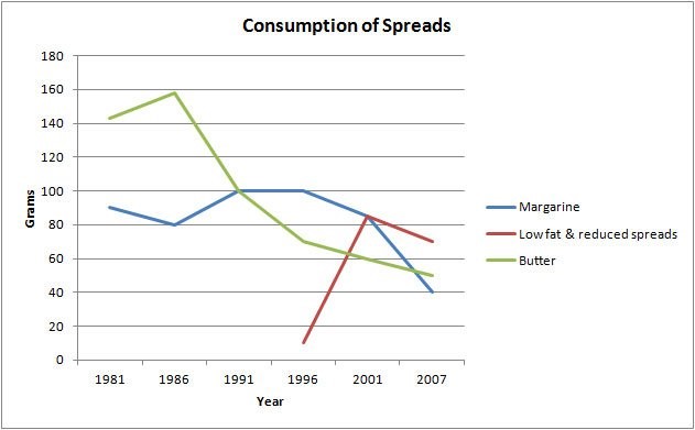
Margarine, Low fat & reduced spreads and Butter consumption
The graph below show the consumption of 3 spreads from 1981 to 2007
The line graph illustrates Margarine , Low fat & reduced spreads and Butter 's consumptions over 16 years from 1981 to 2007 . As it shown in the graph , Margarine was highest around 160 grams at 1991 and 1996 , while Low fat & reduced spreads and Butter were most popular around 100 grams and 85 at 1986 and 2001 . Between 1991 and 1996 , Butter had went down on while Margarine still had a leveling out . By 1999 to the next few years , Low fat & reduced spreads had dramatically increased to peak but Margarine and Butter were falling down . In the last few years on the graph showed that the consumptions of three spreads had all fallen down , specifically Margarine , Low fat & reduced spreads and Butter respectively were around 40 , 70 and 50 at 2007 .

image
Holt Educational Consultant - / 14,835  4782
4782 Ky, I am not going to score your essay at this point because it will not get a passing grade. I would like you to improve upon the problem parts of your essay first because it is obvious that, as your first post, you did not follow the suggested writing format for this task 1 essay. It would be unfair of me to fail you in this essay since you obviously lacked guidance in writing it.
For starters, a Task 1 IELTS essay is supposed to have a minimum of 150 words, spread between 3-5 paragraphs. That means, each paragraph should contain anywhere from 3-5 sentences each. Your essay falls short of this mandatory format. Work on developing the required format in order to gain a chance at a higher task accuracy score.
Now, since the essay needs to have at least 3 paragraphs in order to be considered a full essay, you will need to know how to develop each of the paragraphs in order to meet the required informative summary presentation. This is simple enough to do, provided you understand the graph that you were provided with.
First up, in the opening statement, summarize the instructions that you were provided in the graph and offer a discussion outline. In this case, you could have said:
The line graph provided compares the number of grams that people consume per type of sandwich spread. The three types of spreads to be compared are Margarine, Low fat & reduced spreads, and butter. The comparisons are done using a 6 year gap per year starting in 1991 and ending in 2007.
At that point, you may compare the graph lines as you deem fit. Whatever style you use to discuss the second paragraph, just make sure that you complete your presentation in 5 sentences because that is the maximum sentence requirement.
When you conclude the essay, you can just summarize the information you were provided by repeating what you feel is the most important information in the graph. Or, you can do comparisons of the points where information overlaps for some of the years and spread types.
This is the pretty much standard format that you should always write your Task 1 essays in. Practice using this format in your upcoming practice tests and you should receive some pretty good scores. So the standards for you to remember are:
1. Write at least 150 words in the completed essay.
2. Write at least 3 sentences, maximum of 5 sentences per paragraph.
3. Write at least 3 paragraphs for your presentation.
The work that you did in this essay is good but does not follow the required format. That will result in severely lowered scores. I do not think that this essay will get a passing score so I will not score this one. I'll give you a pass since this is your first ever attempt at writing this sort of essay.
@mygoals
Hello! Make sure that you have at least 150 words in your essay.
Besides, there aren't any paragraphs. It is simply easier to recieve any information when text has a structure.
As it shown in the graph, Margarine was highest around 160 grams at 1991 and 1996
reached a peak in amount of 160 grams between 1991 and 1996
The more you try, the better your score will be ^)

