thewind96
Sep 9, 2021
Writing Feedback / The line graph gives information about the fluctuations of food price index and average oil price [2]
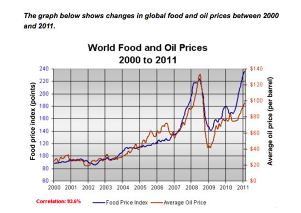
The line graph gives information about the fluctuations of food price index and average oil price in the world from 2000 to 2011.
Overall, the both points of food and oil prices were a correlation. Furthermore, It is remarkable that the oil price was higher than another.
Looking at the graph in detail, while the food price index was about 90 points and the oil price was 20$ at the same in 2000, at the end of 2011 that was a significant growth to around 240 point and 100$, respectively.
Additionally, there was a dramatic rise at the highest points of oil price at about 130 dollars in middle 2008, the figure for the food price index was at 220 points. After only a half year, the both index witnessed a deep drop to 140 points of food index and about 40$ for oil index in 2009. Luckily, the both indexes were the back increase and there was a recovery at the end of the period which was given.
the graph below shows changes in global food and oil prices between 2000 and 2011
The line graph gives information about the fluctuations of food price index and average oil price in the world from 2000 to 2011.
Overall, the both points of food and oil prices were a correlation. Furthermore, It is remarkable that the oil price was higher than another.
Looking at the graph in detail, while the food price index was about 90 points and the oil price was 20$ at the same in 2000, at the end of 2011 that was a significant growth to around 240 point and 100$, respectively.
Additionally, there was a dramatic rise at the highest points of oil price at about 130 dollars in middle 2008, the figure for the food price index was at 220 points. After only a half year, the both index witnessed a deep drop to 140 points of food index and about 40$ for oil index in 2009. Luckily, the both indexes were the back increase and there was a recovery at the end of the period which was given.

1.png
