Writing Feedback /
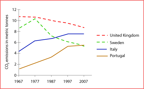
The graph shows average carbon dioxide emissions per person in the UK, Sweden, Italy and Portugal [5]
ielts1 - line graph analysis
The graph below shows average carbon dioxide emissions per person in the UK, Sweden, Italy and Portugal between 1967 and 2007The line graph gives information about how much carbon dioxide ( CO2 ) which each person emissions in four different countries over a period of 40 years. overall, there was a general decline in the production of co2 in UK and Sweden whereas the figure for Italy and Portugal increased steadily.
In the first years, 1967, the emission of co2 in Italy stood at 4.2, then it went u smoothly and reached a peak of 7.8 in 1977. likewise, the figures for Portugal was lower in the beginning of the year which just accounted for 1. next, there was an increase to 5 in the production of co2 and remained stable throughout the remainder of the period.
With regard to UK, in 1967, the emission of co2 was quite higher than that of other countries but after that, there was a gradual decline to nearly 8 at the end of a period. Although the two trends in UK and Sweden were similar in term of general decline, the production of co2 in Sweden varied more significantly than the figure for UK. It reached the highest point of over 10, then it decreased rapidly by over 6 in 2007, which is in the same level of Portugal.

Averagecarbondioxi.png

