Writing Feedback /
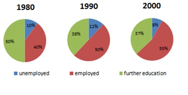
TASK 1:The charts show what Australian school leavers did immediately after leaving secondary school [3]
Summarise the information from the charts
You should spend about 20 minutes on this task.
The charts show what Australian school leavers did immediately after leaving secondary school. Summarise the information by selecting and reporting the main features, and make comparisons where relevant.
You should write at least 150 words.
MY ANSWER:
The pie charts compare the state of Australian who graduated secondary school in 1980, 1990 and 2000.
Overall, students who were employed witnessed an upward trend throughout the years. The reverse pattern is true for the those pursuing further education. Whereas, the proportion of the jobless is the smallest during the period.
It can be seen from the charts that the percentage of students who received a job after graduation from secondary school gradually rose up by 15% in a 20-year timeline, which reached 1st position among all examined categories in the 2000. In contrast, the statistics of people who continually studied further took up the biggest majority in 1980, then had a moderate fall to 37% in 2000.
On the other hand, the two decades saw a fluctuation in unemployment of students graduating secondary school. The figure commenced at 10% in 1980, then slightly increased to 12% in 1990 before having a drop to 8% in 2000. Despite volatile data, it always accounted for a tiny proportion in the three given years.

305543_1_o.jpg

