Tiana
Jan 27, 2022
Writing Feedback / The pie charts illustrate the proportion of six categories of average household expenditures [2]
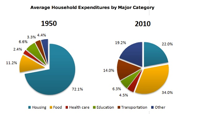
The pie charts illustrate the proportion of six categories of average household expenditures in 1950 and 2010.
Overall, the money spent on housing made up the majority of household expenditures in 1950 as opposed to food expenses in 2010. The percentage of health care expenditure was the least in both years. While the proportion for food, health care, transportation and other expenses increased, that for housing and education dropped during the period given.
Regarding the categories of expenditures that grew, the percentage of money spent on transportation in 2010 (14%) was over 4 times higher than that in 1950 (3.3%) compared to the figure for health care expenses which only doubled over the years (from 2.4% to 4.5%). Significant growth in expenditure could be seen in the food category, which had increased by 22.8% since 1950 and accounted for 34% of the average household expenditure in 2010.
On the other hand, the percentage of housing expenditure went down considerably, from almost three-fourths to around one-fifth of the total expenses, while the figure for education remained relatively stable, at around 6.5%.
IELTS writing task 1 pie charts
The pie charts illustrate the proportion of six categories of average household expenditures in 1950 and 2010.
Overall, the money spent on housing made up the majority of household expenditures in 1950 as opposed to food expenses in 2010. The percentage of health care expenditure was the least in both years. While the proportion for food, health care, transportation and other expenses increased, that for housing and education dropped during the period given.
Regarding the categories of expenditures that grew, the percentage of money spent on transportation in 2010 (14%) was over 4 times higher than that in 1950 (3.3%) compared to the figure for health care expenses which only doubled over the years (from 2.4% to 4.5%). Significant growth in expenditure could be seen in the food category, which had increased by 22.8% since 1950 and accounted for 34% of the average household expenditure in 2010.
On the other hand, the percentage of housing expenditure went down considerably, from almost three-fourths to around one-fifth of the total expenses, while the figure for education remained relatively stable, at around 6.5%.

2 pie charts
