andy241
Jul 6, 2023
Writing Feedback / Line graph - percentage of visitors going to four different tourist attractions in Brighton [2]
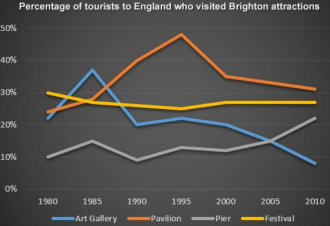
The graph indicates the proportion of visitors to England who went to four different tourist attractions in Brighton between 1980 and 2010.
From an overall perspective, it is obvious that differences in the figure for visitors going to four kinds of places were absolutely striking, with upwards trends being noticed for the Pavilion and the Pier and downward patterns for the other attractions.
To be more specific, despite being the least noticeable body in 1980 with just 10% visitors, the figure of Pier then fluctuated before being reported to see an upsurge from about 12% in 2000 to 22% in 2010. Similarity can be observed in the proportion of visitors going to Pavilion when it showed a magnificent growth from slightly under 25% to 48% in 1995. However, this figure then diminished to more than 30% in 2010 and just 5% higher than that of the Festival in the same year.
By contrast, despite being the most significant attraction at the beginning of the recorded time at precisely 30%, the proportion of people who went to the Festival then witnessed a slight fall to about 28% in 2010 and was more than 3 times greater than that of The Art Gallery in the same year. It is noticeable that the proportion of Pavilion and The Art Gallery was fairly equal with slightly more than 20% in the first year but the figure of that second attraction also showed a downwards trend. Although it went up sharply from 25% in1980 to about 38% in 1985, this figure then dived surprisingly to under 10% at the end of the period.
Thank you for your feedback!

writask16.7.png
