Avencast
May 31, 2013
Writing Feedback / [Task 1] Graph indicating the composition of transportations [3]
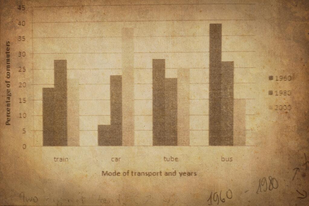
the graph below shows the different modes of transport used to travel to and from work in Europe in 1960, 1980 and 2000.
Write a report describing the information below.
Given is a graph illustrating some great changes in the proportions of four means of transport, which are used for traveling and working in Europe, between 1960 and 2000. Overall, the percentage of car experienced a dramatic growth whereas that of public transports (train, tube and bus) declined gradually.
Initially, in the period from 1960 to 1980, there was an upward trend for both car's and train's figures. In detail, car's percentage increased tremendously from above 7% to approximately 23%. The proportions of tube and bus, however, saw a downward trend. Bus's occupation from 38% in 1960 declined sharply down to 27% in 1980.
From 1980 to 2000, the individual trends of car's and bus's percentage were believed to happen again. In particular, car's figures continued to rose, reaching a peak at above 37% whereas that of bus decreased continuously to 15%. With regards to the percentage of train and tube, while train's declined markedly by 6%, tube's proportion grew steadily to 25% in 2000.
To sum up, growing with a significant speed, car's figures was believed to occupied the largest percentage in the composition in 2000.
(182 words)
Can you guys help me fix this, I'm freshly new to IELTS writing and I have to get >6.5 in writing test next month

BLgfv_WCAAAYldc.jpg
