wuchunhung0927
Aug 9, 2017
Writing Feedback / The charts below show the percentage of water used for different purposes in six areas of the world [3]
Personally, although i write it, i don't think it is a good article. I think there are redundant in some sentence, can you give me an advice and the band score i may reach in IELTS ? I will very appreciate if you can do that, Thank you.
The charts below show the percentage of water used for different purposes in six areas of the world.
Summarize the information by selecting and reporting the main features, and make comparisons where relevant.
The given pie charts show the proportion of three water usage in six area of the world. Overall, the common usage of water is for industrial and agriculture.
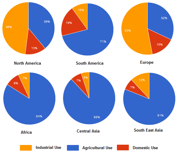
In terms of industry use, the illustration present the North America and Europe required more water for industrial than the South America, Africa and Asia. Both North America and Europe spent nearly half or more water for industrial, which is 48% and 53% in order, while South America, Africa and Asia spent between 5% to 12%.
For agricultural use, the illustration present a heavy use of water in South America, Africa and Asia. The agricultural sector spent more than 70% of water in this three areas, while North America and Europe spent less than 40%.
For domestic use, it was the lowest percentage of the usage of water in North America, Europe and South East Asia, which is 13%, 15% and 7% in order. On the other hand, it was second in South America, Africa and Central Asia, which in Africa and Central Asia, it just a slightly more than the industry use.
Personally, although i write it, i don't think it is a good article. I think there are redundant in some sentence, can you give me an advice and the band score i may reach in IELTS ? I will very appreciate if you can do that, Thank you.
The charts below show the percentage of water used for different purposes in six areas of the world.
Summarize the information by selecting and reporting the main features, and make comparisons where relevant.
comparison of water usage
The given pie charts show the proportion of three water usage in six area of the world. Overall, the common usage of water is for industrial and agriculture.
In terms of industry use, the illustration present the North America and Europe required more water for industrial than the South America, Africa and Asia. Both North America and Europe spent nearly half or more water for industrial, which is 48% and 53% in order, while South America, Africa and Asia spent between 5% to 12%.
For agricultural use, the illustration present a heavy use of water in South America, Africa and Asia. The agricultural sector spent more than 70% of water in this three areas, while North America and Europe spent less than 40%.
For domestic use, it was the lowest percentage of the usage of water in North America, Europe and South East Asia, which is 13%, 15% and 7% in order. On the other hand, it was second in South America, Africa and Central Asia, which in Africa and Central Asia, it just a slightly more than the industry use.

percentageofwater.png

