vivian45222
Nov 2, 2017
Writing Feedback / IELTS Task 1: compared the graph and table about water consumption [2]
Question
The graph and table below give information about water use worldwild and water consumption in two different countries.
Summarise the information by selecting and reporting the main features, and make comparisons where relevant.
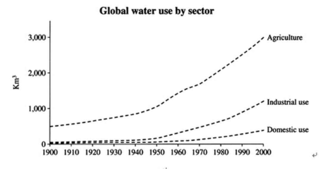
The graph compares water use of the different sectors in the world including agriculture, industrial use and domestic use, from the year 1900 to 2000. The table illustrates Brazil and Congo consume the amount of water in 2000.
Overall, the amount of water consumption was an upward trend in all three sectors between 1900 and 2000. Brazil experienced higher water consumption for each person than Congo.
The water consumption for agriculture was around 500km3 in the year 1900, and steadily increased to approximately 3000 km3 in 2000 which is the most amount than other sectors. In 1900, industrial and domestic use consumed around 100km3. And then, the amount of these two sectors gradually rose around 800km3 and 400 km3, respectively.
The table shows that Brazil had 176 million people with 26500km2 irrigated area and the water consumption for each person was 259m3 in 2000. In the meantime, there were 5.2 million population with 100m3 agriculture area and 8m3 water consumption per person is calculated in Congo.
Question
The graph and table below give information about water use worldwild and water consumption in two different countries.
Summarise the information by selecting and reporting the main features, and make comparisons where relevant.
water usage of the different sectors in the world
The graph compares water use of the different sectors in the world including agriculture, industrial use and domestic use, from the year 1900 to 2000. The table illustrates Brazil and Congo consume the amount of water in 2000.
Overall, the amount of water consumption was an upward trend in all three sectors between 1900 and 2000. Brazil experienced higher water consumption for each person than Congo.
The water consumption for agriculture was around 500km3 in the year 1900, and steadily increased to approximately 3000 km3 in 2000 which is the most amount than other sectors. In 1900, industrial and domestic use consumed around 100km3. And then, the amount of these two sectors gradually rose around 800km3 and 400 km3, respectively.
The table shows that Brazil had 176 million people with 26500km2 irrigated area and the water consumption for each person was 259m3 in 2000. In the meantime, there were 5.2 million population with 100m3 agriculture area and 8m3 water consumption per person is calculated in Congo.

ieez_201711.png
ieez_201711.png

