callmelagom
Jul 23, 2021
Writing Feedback / The line chart about people living in Australia who were born in Asia, the UK, and other regions [2]
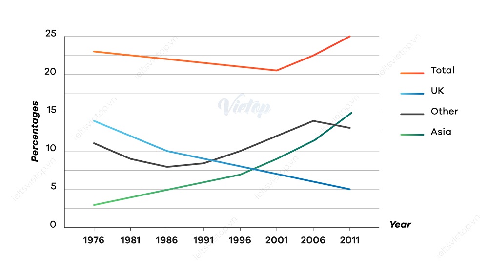
The graph below gives information about the percentage of people living in Australia who were born in Asia, the UK, and other regions.
The line chart given illustrates the proportion of who were born on Asia, the UK, the other region and the total of people living in Australia from 1976 to 2011.
Overall, it is clear that while the percentage of people who born in Asia and on the other witnessed an upward trend, there was a downward trend in the figure region mentioned. In addition, the figure for Asian people experienced the most noticeable change during the research period.
Looking at the graph in more details, in 1976, the proportion of the total of people living in Australia registered about 23 percent, in comparison with approximately 14, 11, 3 percent of the UK, the other region and Asia respectively. During the 32- year starting from 1976, the figure foe Asia increased sharply to roughly 15 percent in 2011.
Similarly, from 1991 to 2011 the figure for who born in the other also rose significantly after dropping remarkable in the lowest level in 1986. In contrast, the figure for British saw a rapid decline during the period of 35 years. Besides, in 25 years starting from 1976, the percentage of people living in Australia in total decreased slightly before growing considerably to about 25 percent in 2011
writing task 1 - australian population diversity
The graph below gives information about the percentage of people living in Australia who were born in Asia, the UK, and other regions.
The line chart given illustrates the proportion of who were born on Asia, the UK, the other region and the total of people living in Australia from 1976 to 2011.
Overall, it is clear that while the percentage of people who born in Asia and on the other witnessed an upward trend, there was a downward trend in the figure region mentioned. In addition, the figure for Asian people experienced the most noticeable change during the research period.
Looking at the graph in more details, in 1976, the proportion of the total of people living in Australia registered about 23 percent, in comparison with approximately 14, 11, 3 percent of the UK, the other region and Asia respectively. During the 32- year starting from 1976, the figure foe Asia increased sharply to roughly 15 percent in 2011.
Similarly, from 1991 to 2011 the figure for who born in the other also rose significantly after dropping remarkable in the lowest level in 1986. In contrast, the figure for British saw a rapid decline during the period of 35 years. Besides, in 25 years starting from 1976, the percentage of people living in Australia in total decreased slightly before growing considerably to about 25 percent in 2011

dethiieltswriting.jpg
