Taldi
Nov 19, 2024
Writing Feedback / IELTS 1 - Bar Chart (Weekly Income Change Over Time) [3]
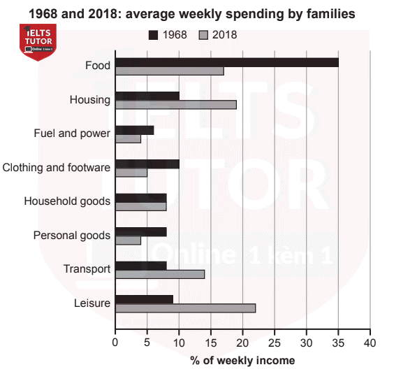
The chart below gives information about how families in one country spent their weekly income in 1968 and in 2018.
Summarise the information by selecting and reporting the main features, and make comparisons where relevant.
The given table illustrates the amount of money was weekly spent by families in 8 different categories in unspecified country between 1968 and 2018. Overall, there was a significant increase in leisure, transport, and housing while the opposite was true for other groups, except for household goods. In addition, Fuel and power was the least spent in two given years.
Looking at the chart, leisure started at roughly 8% of weekly income in 1968 before experienced a tremendous increase to slightly over 20%, which became the highest figure in 2018. Similarly, there was a rise of transport and housing spent from approximately 10% and 6% to just under 20% and 15% respectively.
In contrast, the major expenditure in 1968 belonged to food at 35%, it then plummeted to roughly 17% in the next period. Moreover, fuel and power with personals good categories fluctuated around 5% to 7% while household goods remain unchanged in both 1968 and 2018.
*I think I just did my essay like a robot, what's your suggestion?*

aa.png
