Unanswered [7] | Urgent [0]
  

Posts by WaddahHamzah
Name: Andi Mawaddah Hamzah
Joined: Dec 12, 2019
Last Post: Dec 22, 2019
Threads: 1
Posts: 2  
From: Indonesia

Displayed posts: 3
sort: Latest first   Oldest first  | 
WaddahHamzah   
Dec 13, 2019
Writing Feedback / In the chart the percentage of people using multiple social networking sites; Ielts 2 [4]

Hello there..

Let me give you some comments:

Firstly, it is about your introduction. I found you did not paraphrase the question. It will be better if you write:

The bar chart illustrates the percentage use of multiple social networking sites in ...

or

The bar chart illustrates the percentage of people using multiple social networking sites in ...

you can also change it into passive sentence. For example:

The percentage use of multiple social networking sites by Canadian in two different years, 2014 and 2015, is illustrated in the chart.

As it can be seen, it is specifically discuss about the percentage of the use or the people, either for those who do not have any social networking accounts, or use one or even more.

Next, When it comes to the overall, you only put one trend which for me, it is too specific. Try to write the general trend while including the language of comparison and changes to your overall. If I were you, I will write at least two sentences.

Let me give you an example:

Overall, majority people in Canada tend to use one social media site compared to the other preferences, and this significantly contrasted to the percentage of people with 5 social sites, which was the lowest one. Also, the figure of users with more than one online social platforms experienced a slight increase in the following year.

Hopefully. those might be beneficial for you.

Best Regard,

WaddahHamzah
WaddahHamzah   
Dec 12, 2019
Writing Feedback / The comparison of user involvement for four different online social platforms [3]

Writing Task 1 IELTS Social Media


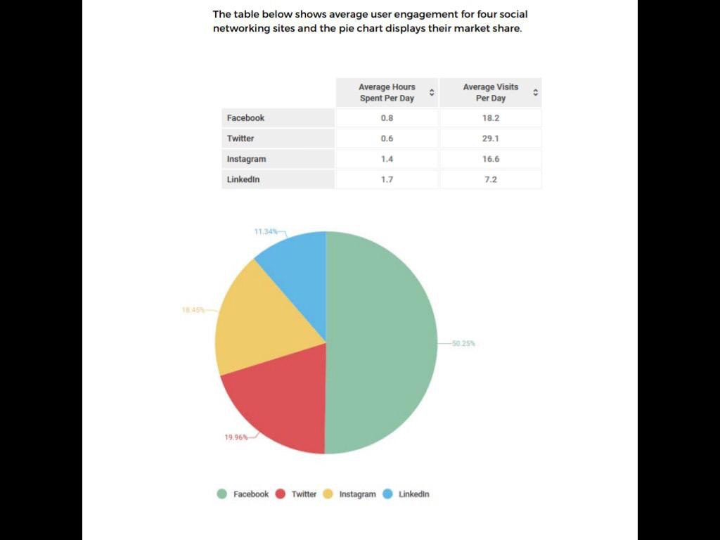
The table illustrates the comparison of user involvement for four different online social platforms, while the percentage of their market share is given in the chart.

In every day, most people prefer to visit Twitter more often with average at 29,1 times, which indicates it as the most favourite social platform, while the number of facebook daily visits is accounted as the second position. However, those users spend the minimum hours per day for accessing both social media. Also, Facebook dominates market share successfully with more than a half percentage, and this contrasts to the other networking sites.

As the remaining social networking platforms, LinkedIn and Instagram are being accessed for the longer times rather than the previous ones, however, the average of daily visits shows the reverse with only 16.6 for the former and 7.2 for the latter. When it comes to the market, both of them also have the lowest percentage with around 12% and 19% respectively.

Overall, Twitter is the most preferable social media since it has the highest rate of daily visits, followed by Facebook which has dominated the market share. Whilst the LinkedIn has the highest proportion of time passed per day, the number of its visits experienced the lowest rate as well as Instagram.


  • TableandChartso.png
Need Writing or Editing Help?
Fill out one of these forms:

Graduate Writing / Editing:
GraduateWriter form ◳

Best Essay Service:
CustomPapers form ◳

Excellence in Editing:
Rose Editing ◳

AI-Paper Rewriting:
Robot Rewrite ◳

Academic AI Writer:
Custom AI Writer ◳