Unanswered [1] | Urgent [0]
  

Posts by jaynguyen [Suspended]
Name: janguyenn
Joined: Apr 21, 2020
Last Post: Jul 26, 2021
Threads: 2
Posts: 2  
From: Viet Nam
School: da nang university

Displayed posts: 4
sort: Latest first   Oldest first  | 
jaynguyen   
Jul 25, 2021
Writing Feedback / IELTS WRITING TASK 1 - The bar chart below shows shares of expenditures for five major categories [4]

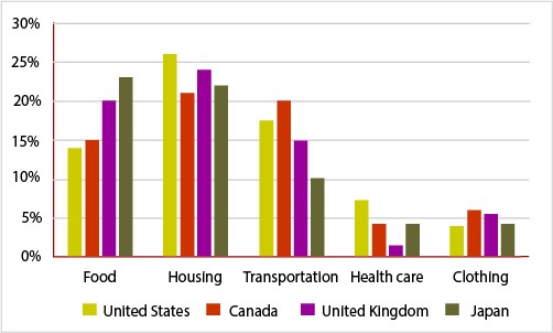
**The bar chart below shows shares of expenditures for five major categories in the United States, Canada, the United Kingdom, and Japan in the year 2009.**

**Write a report for a university lecturer describing the information below.**


The information given in the chart makes comparisons in the number of money was spend on five categories such as food, housing, transportation, health care and clothing in four different countries in 2009.

While the figures for spending of people in four countries have many disparities, it is clear that spender allocated much more for housing than any other categories. Health care and clothing, on the other hand, received the least expenses by people of these four given countries.

As can be seen from the graph, people in four countries invest over 20% of their total expenditure in housing. American expenditure on this category was highest (over 25%) while the proportion of expenses made by people in other countries remained with over 20% total expenditure. Food was the second most expensive category in UK and Japan. Japanese and British spent over 20% on food whereas spending of people in Canada and US was lower, just roughly 15%. For the US and Canada, transportation was the second expensive sector which cost around 17% to 20% while that was cheaper in UK and Japan, just 15% and 10% respectively.

Health care and clothing were two sectors that had inexpensive costs. Only American expended more than 15% on health care, in other countries people spent just less than 5%. Finally, clothing comprised over 5% in Canada and UK while in US and Japan this figure just at roughly 4%.


  • sharesofexpenditur.jpg
jaynguyen   
Jul 24, 2021
Writing Feedback / IELTS WRITING TASK 1 - The chart shows the percentage of women and men in one Asian country who pass [3]

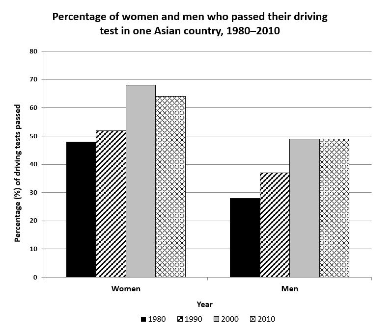
driving test pass rates in asia


The chart shows the percentage of women and men in one Asian country who passed when they took their driving test between 1980 and 2010.
Summarise the information by selecting and reporting the main features, and make comparisons where relevant.
You should spend about 20 minutes on this task.


The bar graph shows the proportion of each gender who got a driver's license from 1980 to 2010 in one Asian country.
Overall, it is clear that the percentage of women who passed their driving test was higher than that of men over the period of 40 years. In both genders, these figures were low in the first 20 years of the period and increased gradually between 2000 to 2010.

Looking at the graph more closely, one can see that the proportion of women who got driving licenses was lowest in 1980, just nearly 48%. In the next ten years, the number of women who passed the driving test went up moderately by roughly 4%. This figure reached the highest of 68% in 2000 and declined slightly to 65% in 2010.

The similar pattern was seen on the percentage of men who got drive's license between 1980 to 1990. In 1980, the pass driving rate of men was nearly 28% and then this figure grew up by 10% in 1990. Ten years later, the number peaked at nearly 50% and then maintain stability this number to 2010.


  • 3a99ec43c6524c638.png
Do You Need
Academic Writing
or Editing Help?
Fill out one of these forms:

Graduate Writing / Editing:
GraduateWriter form ◳

Best Essay Service:
CustomPapers form ◳

Excellence in Editing:
Rose Editing ◳

AI-Paper Rewriting:
Robot Rewrite ◳

Academic AI Writer:
Custom AI Writer ◳