hthesheep
Jul 24, 2021
Writing Feedback / Writing task 1: Pie chart - The pie charts compare the number of owned and rented houses in the UK [2]
The pie charts below show the percentage of housing owned and rented in the UK in 1991 and 2007.
Summarize the information by describing the main features of the charts and making comparisons where appropriate. Write at least 150 words.
The pie charts compare the number of owned and rented houses in the UK in terms of 4 categories in two different years.
It is noticeable that homeowners account for the largest proportion in both years and the number of houses increased in 2007.
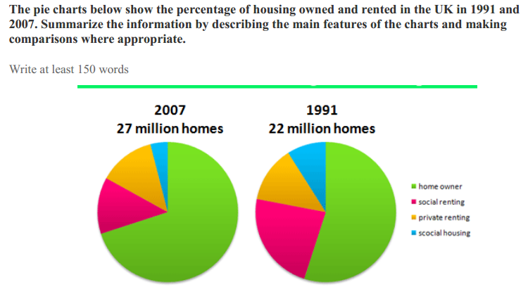
In 1991, homes owned by UK residents accounted for more than half of the total number of 22 million houses, while the figure for rented homes for social purposes stood at around 25%. Both privately rented homes and social housing shared considerably the same percentage, with approximately 11% and 10% respectively.
In 2007, it is clear that the percentage for homeowners increased by 10%, and remained as the largest proportion on the chart. However, this resulted in a decline of about 10% in the number of socially rented homes and about 5% in social housing. While these aforementioned categories saw changes in 2007, the percentage for private rented houses remained constant.
My work seems to lack comparison between the figures but I still don't know which figures should be compared. I would appreciate your help! Thank you :)
summArise Information from the charts
The pie charts below show the percentage of housing owned and rented in the UK in 1991 and 2007.
Summarize the information by describing the main features of the charts and making comparisons where appropriate. Write at least 150 words.
The pie charts compare the number of owned and rented houses in the UK in terms of 4 categories in two different years.
It is noticeable that homeowners account for the largest proportion in both years and the number of houses increased in 2007.
In 1991, homes owned by UK residents accounted for more than half of the total number of 22 million houses, while the figure for rented homes for social purposes stood at around 25%. Both privately rented homes and social housing shared considerably the same percentage, with approximately 11% and 10% respectively.
In 2007, it is clear that the percentage for homeowners increased by 10%, and remained as the largest proportion on the chart. However, this resulted in a decline of about 10% in the number of socially rented homes and about 5% in social housing. While these aforementioned categories saw changes in 2007, the percentage for private rented houses remained constant.
My work seems to lack comparison between the figures but I still don't know which figures should be compared. I would appreciate your help! Thank you :)

Capture4.PNG
