kachyy
Jul 12, 2022
Writing Feedback / The graph & chart give information and forecast about the vehicle and CO2 emission (England, Wales) [2]
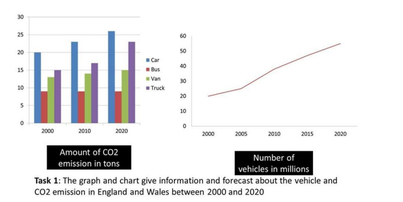
The given bar chart illustrates the amount of co2 emission and the line graph shows the number of vehicles in England and Wales between 2000 and 2020.
Overall, the emission in 2020 was the highest, especially for car emissions. The number of transportations had increase significantly during this period of time.
The emissions from cars was the highest in every year and it gradual increased from 20 tons in 2000 to over 25 tons in 2020. The truck and van emissions also witnessed a growth. The amount of emission from truck grew from 17 tons in 2000 to 18 tons while the van emissions slightly rose to 15 tons in 2020. In contrast, the emissions from bus remain stable all the time at around 9 tons.
The number of vehicles increased from 20 million from 2000 to about 40 million in 2010 and reached a peak of 55 million in 2020.
number of vehicles and co2 emissions
The given bar chart illustrates the amount of co2 emission and the line graph shows the number of vehicles in England and Wales between 2000 and 2020.
Overall, the emission in 2020 was the highest, especially for car emissions. The number of transportations had increase significantly during this period of time.
The emissions from cars was the highest in every year and it gradual increased from 20 tons in 2000 to over 25 tons in 2020. The truck and van emissions also witnessed a growth. The amount of emission from truck grew from 17 tons in 2000 to 18 tons while the van emissions slightly rose to 15 tons in 2020. In contrast, the emissions from bus remain stable all the time at around 9 tons.
The number of vehicles increased from 20 million from 2000 to about 40 million in 2010 and reached a peak of 55 million in 2020.

289614335_3246475625.png
