littlered990
Oct 7, 2022
Writing Feedback / IELTS writing task 1 with a line graph about carbon dioxide emission [3]
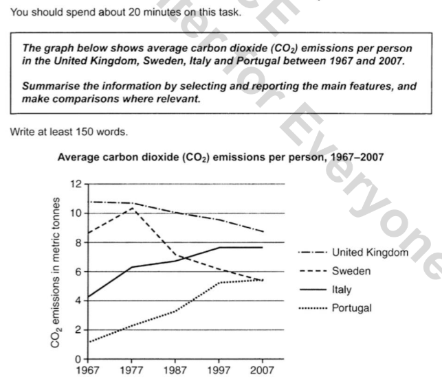
The line graph illustrates the average amount of carbon dioxide each person emitted in 4 European countries during a 40-year period from 1967.
Overall, whereas the figure of the UK took the first place despite having dropped, that of Portugal was opposite.
As can be seen from the chart, the mass of carbon dioxide emitted in Italy started the period at about 4 tonnes and continuously grew in the next 3 decades. In 1990 it peaked at nearly 8 tonnes and remained stable until the end of the period. Similarly, the figure of Portugal went up steadily by over 4 tonnes until 1997 and leveled off at over 5 tonnes during the last 10 years. Despite this marked growth, it took the last place in the end.
However, carbon emissions in both the United Kingdom and Sweden followed downward patterns. In spite of a consistent decline from 11 tonnes to 9 tonnes, residents in the former country still emitted the most carbon dioxide in 2007. Meanwhile, although in the first 10 years there was an increase of more than 1 tonne, this figure of the latter country considerably fell during the next decade and hit the bottom of around 5 tonnes, the same ending point as Portugal.
co2 emissions per person
The line graph illustrates the average amount of carbon dioxide each person emitted in 4 European countries during a 40-year period from 1967.
Overall, whereas the figure of the UK took the first place despite having dropped, that of Portugal was opposite.
As can be seen from the chart, the mass of carbon dioxide emitted in Italy started the period at about 4 tonnes and continuously grew in the next 3 decades. In 1990 it peaked at nearly 8 tonnes and remained stable until the end of the period. Similarly, the figure of Portugal went up steadily by over 4 tonnes until 1997 and leveled off at over 5 tonnes during the last 10 years. Despite this marked growth, it took the last place in the end.
However, carbon emissions in both the United Kingdom and Sweden followed downward patterns. In spite of a consistent decline from 11 tonnes to 9 tonnes, residents in the former country still emitted the most carbon dioxide in 2007. Meanwhile, although in the first 10 years there was an increase of more than 1 tonne, this figure of the latter country considerably fell during the next decade and hit the bottom of around 5 tonnes, the same ending point as Portugal.

IE154LWLesson7.png
