roygao2008
Jul 22, 2011
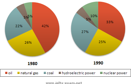
Writing Feedback / IELTS : The two graphs show the main sources of energy in the USA [2]
this is my essay, leave your comment below, thx in advance.
The two graphs depicts the change of energy sources in the USA across 10 years period.
Oil in 1980 took up the largest share in the market, 42%, although it decreased to 33% in 1990. The usage of natural gas, as the second largest one in 1980, dropped 1% only. Coal supplied the third largest energy in 1980, increased its proportion from 22% to 27% and overtook natural gas becoming the second largest energy provider. Hydroelectric power and nuclear power made up equally 5% in 1980, with nuclear power doubled the market share in 1990.
In summary, the traditional energy sources were major power supplier, accounted for 85% in 1990, including oil, natural gas and coal, whereas the government began to invest high-tech energy sources, such as nuclear power.

G113.png
