Writing Feedback /
IElTS: Traveling to and from the UK chart - increasing numbers after 1999 [4]
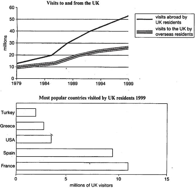
The charts below give information about travel to and from the UK, and about the most popular countries for UK residents to visit. Summarise the information by selecting and reporting the main features and make comparisons where relevant. Write at least 150 words
here is my answer
(A)The given line chart indicates the number of people who travelled to and from the UK during the 2 decades ended 1999.The bar chart illustrates five popular countries where the British visited the most in the year of 1999.
(B1)
From the former line chart, either the English that visited abroad (12millions)or foreign visitor(10millions) were minimal at the beginning of 1970.Both of those increased steadily since then. The number of UK tourists travelled abroad rose rapidly from 1985 to 1999.The relevant amount then reached at approximately 51millions.In contrast, of that who are visit to the UK increased much slowly and arrived at only 22millions in the start of 1999.
(B2)
The latter bar chart gives more details about where British people travelled to during 1999.It's noted that France is the most popular place to visit by 13millions of the English while Spain is just slightly less popular by 2millions UK people. The rest of countries are far way behind which is USA, Greece and Turkey by 4millions, 3millions and 2millions respectively.
(C1)
As we can seen, people who travel to and from the UK will keep increasing after 1999.To concluded, mostly UK residents prefer etiher go to France or Spain.
Also i want some feedback ,please ><

210707_1_o.jpg

