smeak
May 21, 2014
Writing Feedback / IELTS Task 1 - fast food graph and chart [2]
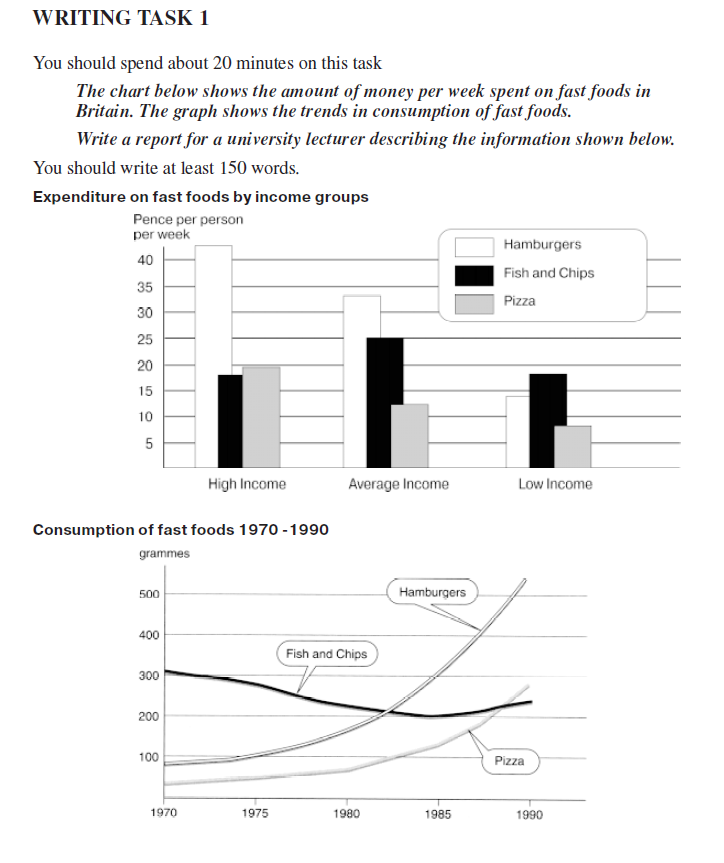
The chart shows how much money people spend on fast food per week depending on their income, whereas the graph says how the consumption of fast food changed in the years 1970-1990.
The first thing we can see is that people with high household income eat more expensively than ones with worse salary. It's mainly showed in expenditure on hamburgers - people with high income spend 40 pences per week for hamburgers, where these with low income spend only 15. Fish and chips are being bought mostly by people with average salaries - they spend 25 pences per week on it. Pizza is most popular in high income houses - they spend 20 pences per week on pizza, when people with low income spend fewer than 10 pences on it.
The graph shows that the consumption of pizza systematically increases with time despite the fact it was the least eaten fast food in 1970 - people were eating only 50 grammes of pizza per week on average. Fish and chips were losing their popularity in years 1970-1985, but after 1985 they started to gain it. Hamburgers are constantly getting more popular, in year 1980 people were eating twice as much hamburgers compared to pizza and fish and chips.

asdasd.png
