Yunghsin
Sep 6, 2016
Writing Feedback / The pie graphs compare the proportion of average budget spent by household for 6 specific categories [4]
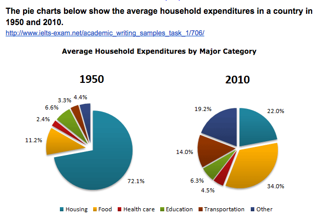
The pei graphs compare the proportion of 6 categories of spending by homes in a country between 1950 and 2010. It is clear that the majority number of expenditures by homes is 'housing' in 1995, while 'food' become the number one of household spending in 2010.
According to the figures, 72.1% of 'housing' is the most number of household expenditures in 1950, compared to dropped to 22.0%. Also, there was can be seen a small decline patterm which was 'education' - from 6.6% in 1950 to 6.3% in 2010.
However, completely different trends reveals other categories throughout the period shown. Apart from 'housing' and 'education', other portions all rose. 'Food' obvious substantially climbed from 11.2% in 1950 to 34.11% in 2010. 'Other' and 'transportation', at the same time, they both grew over 10%. The former increased from 4.4% in 1950 to 19.2% in 2010, while the latter rised from 3.3% in 1950 to 14.0% in 2010. Interestingly, 'Health care' showed a small growth just at 2.1%.

_20160906_11.0.png
