Unanswered [2]
  

Home / Writing Feedback   % width   Posts: 5


IELTS Task 1: The chart below shows the total number of minutes (in billions) of telephon


Serapke 8 / 12  
Feb 5, 2014   #1
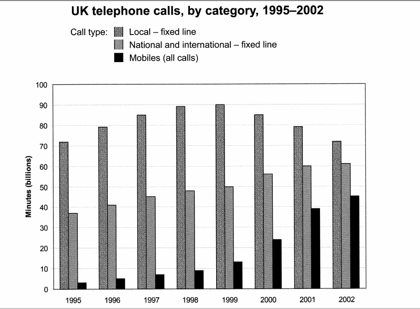
The chart below shows the total number of minutes (in billions) of telephone calls in the UK, divided into three categories, from 1995-2002.

The bar chart provides the information about the popularity of three separate categories of telephone calls in the United Kingdom from 1995 to 2002.
First of all, the graph clearly shows that local fixed line calls were the most popular throughout the period. It was followed by nation and international fixed line calls and mobile calls, both of with were becoming increasingly popular.

Furthermore, the local fixed line calls were rising steadily popular from approximately 72 billion minutes in 1995 to the peak of 90 billion minutes in 1995. Then suddenly from 2000 the numbers began to fall and in 2002 the number was back to the 1995 figure. On the other hand, the popularity of both national and international calls on fixed line were raising through all of the period, starting with 38 billion minutes in 1995 and ending with 60 billion minutes in 2002. However, the most significant rising was noticed in mobile calls. Beginning with approximately 3 billion minutes in 1995, it raised to 45 billion minutes in 2002.

Overall, the bar chart emphasizes the enormous growth in mobile calls and a steady fall in local fixed line calls between 1995 and 2002.

  • soxx.png


fikri 5 / 310  
Feb 5, 2014   #2
Furthermore, the local fixed line calls were rising steadily popular from approximately 72 billion minutes in 1995 to the peak of 90 billion minutes in 1995.

be careful with the using of preposition. it is rarely 'peak' is followed by 'of'. it should be 'peak at'

both of with were becoming increasingly popular.

it seems to me that this sentence doesn't clear, i don't understand
Pahan 1 / 1824  
Feb 5, 2014   #3
The bar chart provides the information about the popularity of three separate categories of telephone calls in the United Kingdom from 1995 to 2002.

Very good introduction :)

First of all, the graph clearly shows that local fixed line calls were the most popular throughout the period. It was followed by nation and international fixed line calls and mobile calls, both of with were becoming increasingly popular.

"First of all" - this is not so appropriate for a report. This task is aimed at assessing your report writing skills. So adopt a more official tone which is appropriate for a report. Be concise and clear in presenting the trends and observations.

Overall, the local fixed line calls had been the most popular throughout the period. Both International fixed line calls and Mobile calls had kept increasing their popularity while Mobile calls had shown a higher growth in this trend.
MisterWandering 18 / 314  
Feb 5, 2014   #4
Furthermore, the local fixed line calls were rising steadily popular from approximately 72 billion minutes in 1995 to the peak of 90 billion minutes in 1995.

There was a steady rise in the number of local fixed line calls in the first half of the period, eventually reaching a peak of 90 billion in 1999.

Then suddenly from 2000 the numbers began to fall and in 2002 the number was back to the 1995 figure

.
Then it began to fall gradually to approximately 70 billion in 2002, which was the same as the 1995 figure.

On the other hand, the popularity of both national and international calls on fixed line were raising through all of the period, starting with 38 billion minutes in 1995 and ending with 60 billion minutes in 2002.

On the other hand, the total number of minutes of national and international fixed line calls and mobile calls enjoyed an clearly upward trend throughout the period. The former started off steady at 38 billion in 1995 and subsequently reached a high of around 60 billion at the end of the period.

However, the most significant rising was noticed in mobile calls. Beginning with approximately 3 billion minutes in 1995, it raised to 45 billion minutes in 2002.

Meanwhile, the latter saw the most significant increase in the number of minutes of telephone calls. Its figure was lower than 10 billion in the first four years. However, it ended up the period at 45 billion, which was nine times higher than the 1995 level.

You should pay attention to the difference between "Rise" and "Raise". They are used to depict upward trend but not interchangeable.
dumi 1 / 6793  
Feb 7, 2014   #5
Overall, the bar chart emphasizes the enormous growth in mobile calls and a steady fall in local fixed line calls between 1995 and 2002.

Well, this sounds more or less like an overview which should have come earlier in your essay. For this task, you need not to write conclusions as this is about report writing. You are reporting your observations to the reader. So, stick to the structure - Introduction, Overview, Details :)


Home / Writing Feedback / IELTS Task 1: The chart below shows the total number of minutes (in billions) of telephon
ⓘ Need Writing or Editing Help?
Fill out one of these forms for professional help:

Best Writing Service:
CustomPapers form ◳

Graduate Writing / Editing:
GraduateWriter form ◳

Excellence in Editing:
Rose Editing ◳

AI-Paper Rewriting:
Robot Rewrite ◳