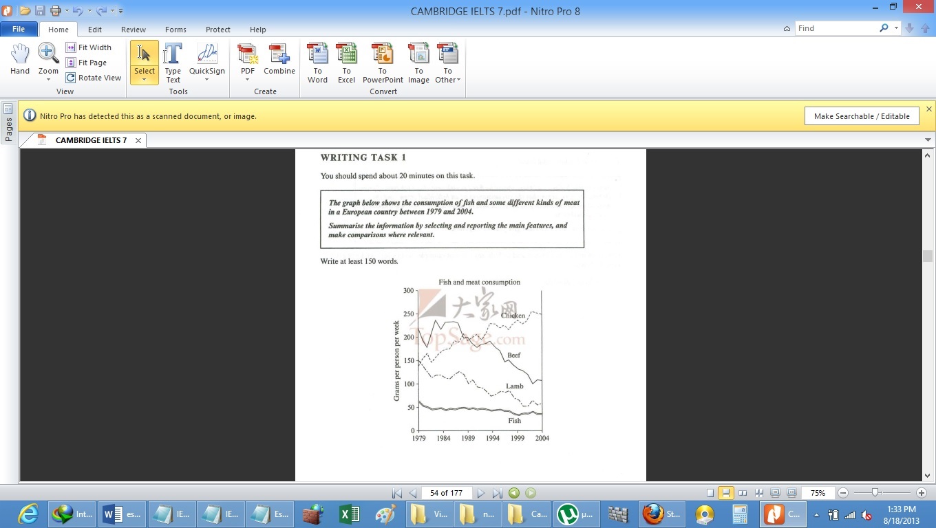
ESSAY PROMPT : THE graph ( see attachment ) shows the consumption of fish and some different kinds of meat in a European country between 1979 and 2004
summarise the information by selecting and reporting the main features, and make comparisons where relevant
CAMBRIDGE IELTS 7 TEST 2 WRITING TASK 1
The illustrated line graphs represents a comparison amongst various kind of meats eaten by Europeans (chicken, beef, lamb and fish) respectively over the 25 years i.e. from 1979 to 2004
Fish line graph starts off with lowest consumption amongst the four from 1979 at approximately 60grams/person/week, and slowly continued to decline over the years, finally reaching a 40-30grams/person/week in the year 2004, thus is the least preferred of all
Beef and lamb line graphs also showed decline in their consumption over the years. Beef consumption was reached its peak in 1979 at about 220gramsperpersonperweek, which declined rapidly by 30-40grams approximately in the early 1980's it then recovered rapidly in the year 1984 reaching its peak at 240 grams/person /week .The beef line graph was erratic with occasional dips seen in the early 90's and then in late 90's at about 150gram/person/week, another one in early 2000.The lamb line graph exhibited a capricious consumption trend which was diminishing progressively from the year 1979 to 2005
In contrast, chicken line graph displayed a trend opposite to other line graphs, it began approximately at the same consumption level (150grams/person/week) as the lamb line graph. This graph showed variable upward trend, which increased progressively over the years, reaching a peak of 250grams /person/week in the year 1994 and still continued to rise reaching the highest the consumption rate(260grams/person/week) and preferable type of meat among Europeans.
,
A REQUEST PLEASE : please provide a score out of 9
and please along with your comments instruct how can i stream line my essay writing further
thank you

Please view the image attached for graphs
