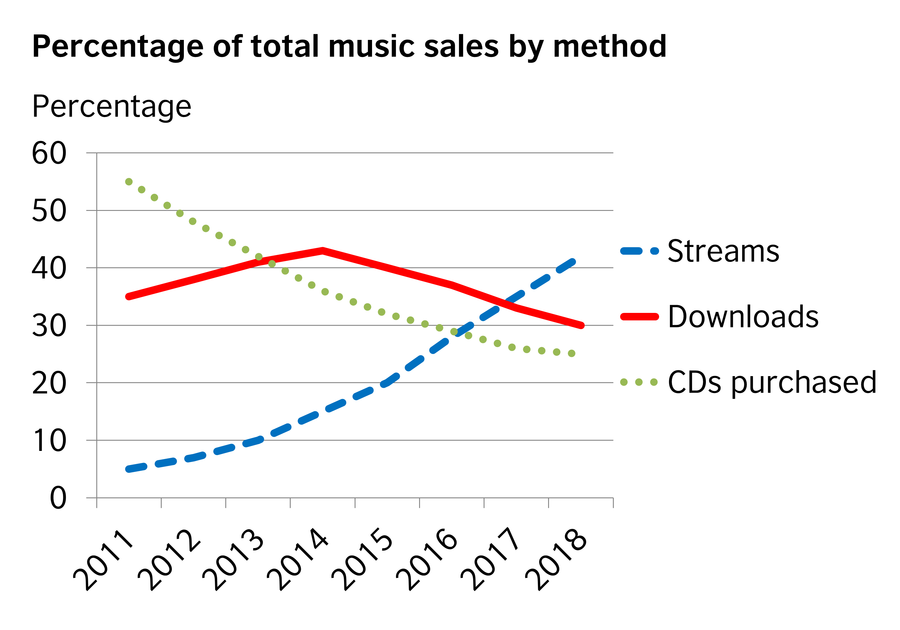
percentage of total music sales by method
The line graph illustrates the proportion of how much three music methods were purchased from 2011 to 2018.
Overall, there was a considerable increase in people streaming music, which became the most widely used method in the final years, while the percentage of downloading and purchasing CDs were witnessed to decrease slightly throughout the period.
A closer look at the graph reveals that the proportion of streaming stood at nearly 5% in 2011, followed by a gradual rise to over 40% in 2018. In regard to downloading, the figure, which accounted for approximately 34% in the first year of the period, was seen to reach a peak at around 41% in the mid-2014 and then decline significantly to nearly 30% in the final year. The percentage of purchasing CDs, which was the most popular music method in the first year of period, represented at approximately 55% in 2011, 11 times higher than that of streaming. However, the figure slightly went down and ended up at only 36% in 2018.

WritingB2Asummary.png
