hieumit107
Oct 12, 2021
Writing Feedback / The line graph shows the percentage of money used for food, leisure, clothing, transport, and fuel [4]
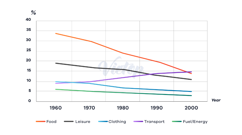
The line graph demonstrates the percentage of money used for food, leisure, clothing, transport, and fuel in certain European countries from 1960 to 2000.
Overall, almost all expenditure was decline. While people use the money for transport was rise.
In 1960, money was spent on food was highest (34%), followed by leisure with 18%. Over the next 40 years, the figure for food and leisure fall dramatically and reach the lowest point each, 14% and 11% respectively. Money consumption for transport was sharp growth and overtook food as the first rank in 2000.
Spending on clothing and fuel decrease slightly from 1960 to 1980. Over the whole 20-year period, both clothing and fuel stay unchanged around 5% and 4%.
the proportion of total expenditure in a certain European country
The line graph demonstrates the percentage of money used for food, leisure, clothing, transport, and fuel in certain European countries from 1960 to 2000.
Overall, almost all expenditure was decline. While people use the money for transport was rise.
In 1960, money was spent on food was highest (34%), followed by leisure with 18%. Over the next 40 years, the figure for food and leisure fall dramatically and reach the lowest point each, 14% and 11% respectively. Money consumption for transport was sharp growth and overtook food as the first rank in 2000.
Spending on clothing and fuel decrease slightly from 1960 to 1980. Over the whole 20-year period, both clothing and fuel stay unchanged around 5% and 4%.

Picture1.png
