quandz
Aug 7, 2022
Writing Feedback / The graph below gives information from report about consumption of energy in the USA [4]
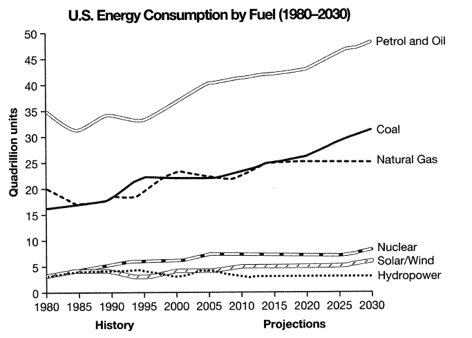
The graph below gives information from 1 2008 report about consumption of energy in the USA since 1980 with projections until 2030.
Summarise the information by selecting and reporting the main features, and make comparisons where relevant.
My posts:
The infographic illustrates the USA from 1980 to 2030 in terms of the proportion of energy production.
From a general respective, there was an increase in the number of energy consumption namely Petrol and Oil, Coal, Natural Gas, Nuclear, Solar/Wind, but the opposite was true for the figure for Hydropower.Petrol and Oil was by far the most popular energy usage however hydropower generated the least amount of energy in the USA
( I just write overview and introduction )
Consumption of energy in the USA
The graph below gives information from 1 2008 report about consumption of energy in the USA since 1980 with projections until 2030.
Summarise the information by selecting and reporting the main features, and make comparisons where relevant.
My posts:
The infographic illustrates the USA from 1980 to 2030 in terms of the proportion of energy production.
From a general respective, there was an increase in the number of energy consumption namely Petrol and Oil, Coal, Natural Gas, Nuclear, Solar/Wind, but the opposite was true for the figure for Hydropower.Petrol and Oil was by far the most popular energy usage however hydropower generated the least amount of energy in the USA
( I just write overview and introduction )

detask1cam9test4..png
