kocc2003
Feb 17, 2017
Writing Feedback / The pie charts illustrate how the proportion of annual expenditure was changed in a UK school [4]
The three pie charts below show the changes in annual spending by a particular UK school in 1981, 1991 and 2001.
Summarise the information by selecting and reporting the main features, and make comparisons where relevant.
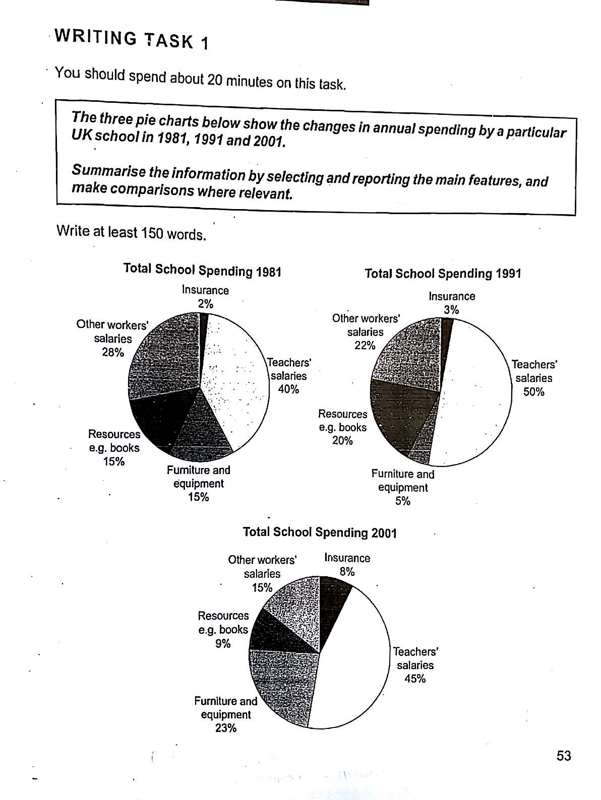
The three pie charts illustrate how the proportion of annual expenditure was changed in a UK school in 1981, 1991 and 2001.
Overall, what stands out from the graph is that the biggest expenditure was on teachers' salaries throughout the 20 years, while insurance stayed on the lowest spending. Another interesting point is that there was a huge invest in furniture and equipment from 1991 to 2001.
Looking at the details, in 1981, 40% of total school expenditure was on teachers' salaries and in 1991, it considerably increased by 10%. Afterwards it slightly decreased to 45% in 2001, but still remained on first place. In terms of insurance, there was only 2% and 3% of expenditure in 1981 and 1991 respectively. However, it surged from 3% in 1991 to 8% in 2001.
With regards to furniture and equipment, by 1991 there was a drop by 10%, from 15% to 5%. However, it significantly rose by 18%, reaching 23% and ranked the second biggest expenditure in 2001.
The three pie charts below show the changes in annual spending by a particular UK school in 1981, 1991 and 2001.
Summarise the information by selecting and reporting the main features, and make comparisons where relevant.
fluctuation of spendings
The three pie charts illustrate how the proportion of annual expenditure was changed in a UK school in 1981, 1991 and 2001.
Overall, what stands out from the graph is that the biggest expenditure was on teachers' salaries throughout the 20 years, while insurance stayed on the lowest spending. Another interesting point is that there was a huge invest in furniture and equipment from 1991 to 2001.
Looking at the details, in 1981, 40% of total school expenditure was on teachers' salaries and in 1991, it considerably increased by 10%. Afterwards it slightly decreased to 45% in 2001, but still remained on first place. In terms of insurance, there was only 2% and 3% of expenditure in 1981 and 1991 respectively. However, it surged from 3% in 1991 to 8% in 2001.
With regards to furniture and equipment, by 1991 there was a drop by 10%, from 15% to 5%. However, it significantly rose by 18%, reaching 23% and ranked the second biggest expenditure in 2001.

New_Doc_20170217.j.jpg
