tommyph
Jul 10, 2017
Writing Feedback / IELTS Task 1: Graph of employment rates in three sectors of UK economy [8]
Hi everyone. Please help me to correct my task 1 writing. Can you suggest other words that I can use to make my writing better in terms of lexical resource. Thank you.
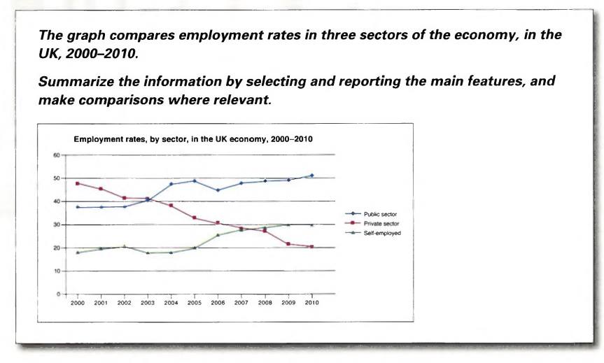
*The graph highlights data about the proportion of people who were employed in three economic sectors in the UK, over a decade between 2000 and 2010.
*Overall, what stands out from the graph is that there were significant upward trends in the figures for public and self-employment sectors, while private area underwent a dramatic decline over the period in question. Another interesting point is that, in 2000, private sector had the highest employment rate among all, but the figure for public sector was higher than those for the others in 2010.
*Looking at details, as regards public sector, the percentage started at nearly 40% in 2000. Having remained stable in the first three years, it then went up sharply to just under 50% in 2005. Following that, there was a remarkable decrease by around 5%, but the proportion soon recovered in the next year. Finally, the figure went through a consistent rise to approximately 52%, reaching its all-time high. The same overall trend was applied for self-employment area. Having fluctuated around 20%, the proportion then rocketed to about 28% in 2008. Subsequently, it kept levelling off at 30% until 2010.
*By contrast, the percentage of private sector went in opposite direction. It decreased considerably from around 48% to just over 40% in 2002. Despite stabilizing the next year, it then fell steadily over the second half of the period to hit its trough of 20% in 2010.
Hi everyone. Please help me to correct my task 1 writing. Can you suggest other words that I can use to make my writing better in terms of lexical resource. Thank you.
public, self-employment sectors and private area in the UK
*The graph highlights data about the proportion of people who were employed in three economic sectors in the UK, over a decade between 2000 and 2010.
*Overall, what stands out from the graph is that there were significant upward trends in the figures for public and self-employment sectors, while private area underwent a dramatic decline over the period in question. Another interesting point is that, in 2000, private sector had the highest employment rate among all, but the figure for public sector was higher than those for the others in 2010.
*Looking at details, as regards public sector, the percentage started at nearly 40% in 2000. Having remained stable in the first three years, it then went up sharply to just under 50% in 2005. Following that, there was a remarkable decrease by around 5%, but the proportion soon recovered in the next year. Finally, the figure went through a consistent rise to approximately 52%, reaching its all-time high. The same overall trend was applied for self-employment area. Having fluctuated around 20%, the proportion then rocketed to about 28% in 2008. Subsequently, it kept levelling off at 30% until 2010.
*By contrast, the percentage of private sector went in opposite direction. It decreased considerably from around 48% to just over 40% in 2002. Despite stabilizing the next year, it then fell steadily over the second half of the period to hit its trough of 20% in 2010.

19875641_83377243345.jpg
