Writing Feedback /
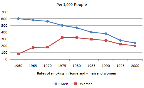
The line chart illustrates the rate of smoking among males and females in Someland from 1960 to 2000 [6]
The number of male vs female smokers
The line chart illustrates the ratio of men and women smoked in Someland between 1960 and 2000. Overal, the rate of male smokers outweighed the females.
As is shown, in 1960, the percentage of men shot up at 600 in every 1000 people then decreased gradually over a forty- year period before constituting under 300 people at the end of the term. In contrast, the rate of women went through a period of wild volatility. Form 1960 to 1975, the figure went up steadily, reaching a peak of 300 followed by a plateau for 5 years. After 1980, the number went down marginally before turning back to 1970's level in 2000 which shows that the ratio of females doubled in 40 years.
In conclusion, the rate of male smokers was greater than that of female counterparts although the female figure witnessed a little increase in the middle of the period.
I will have an IELTS test next month so it is really helpful if I receive your comments. Thank you a lot

305038_2_o.png

