MiAnnn
Jun 18, 2019
Writing Feedback / The graph shows the proportion of people visiting 4 destinations in Brighton - period of 1980 & 2010 [2]
The line graph below shows the percentage of tourists to England who visited four different attractions in Brighton.
Summarise the information by selecting and reporting the main features, and make comparisons where relevant.
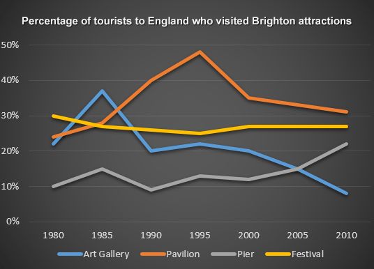
The graph demonstrates the proportion of people visiting 4 destinations in Brighton during the period of 1980 and 2010
As can be seen from the graph,it is clearly evident that the patterns greatly differed over the time frame.While the number of tourists visit pavilion as well as pier tended to increase,that of festival and art galley had an downward trend.
The percentage of visitors to pavilion went up steadily by 30% from more than 20% to nearly 50% between 1980 and 1995. But later this pattern dove steeply to around 35% and gradually declined to 30% in 2010.The percentage of people go to pier had some slight fluctuations then after 2000 there was a dramatic upward to more than 20% in 2010.
An opposite pattern could be observed in the number of visitors to art gallery.As it reached a peak of about 40% in 1985 ,moreover the years 1995 and 2010 experienced a nonstop drop to approximately 10% .
The proportion of tourists to festival remained relatively unchanged around 30%.
( SOME QUESTIONS:
-How can i make a comparision in this
-Are there any word to use instead of "Proportion" or "percentage"?
- Is it okay to use the phrase " the number of " in the "%" essay ?
Tourists to England - LINE GRAPH (ACADEMIC WRITING)
The line graph below shows the percentage of tourists to England who visited four different attractions in Brighton.
Summarise the information by selecting and reporting the main features, and make comparisons where relevant.
The graph demonstrates the proportion of people visiting 4 destinations in Brighton during the period of 1980 and 2010
As can be seen from the graph,it is clearly evident that the patterns greatly differed over the time frame.While the number of tourists visit pavilion as well as pier tended to increase,that of festival and art galley had an downward trend.
The percentage of visitors to pavilion went up steadily by 30% from more than 20% to nearly 50% between 1980 and 1995. But later this pattern dove steeply to around 35% and gradually declined to 30% in 2010.The percentage of people go to pier had some slight fluctuations then after 2000 there was a dramatic upward to more than 20% in 2010.
An opposite pattern could be observed in the number of visitors to art gallery.As it reached a peak of about 40% in 1985 ,moreover the years 1995 and 2010 experienced a nonstop drop to approximately 10% .
The proportion of tourists to festival remained relatively unchanged around 30%.
( SOME QUESTIONS:
-How can i make a comparision in this
-Are there any word to use instead of "Proportion" or "percentage"?
- Is it okay to use the phrase " the number of " in the "%" essay ?

4517DBDDFA1A4FB7A.png

