JoyceTran
Nov 28, 2019
Writing Feedback / IELTS Writing Task 1-Comparative Graph CO2 [3]
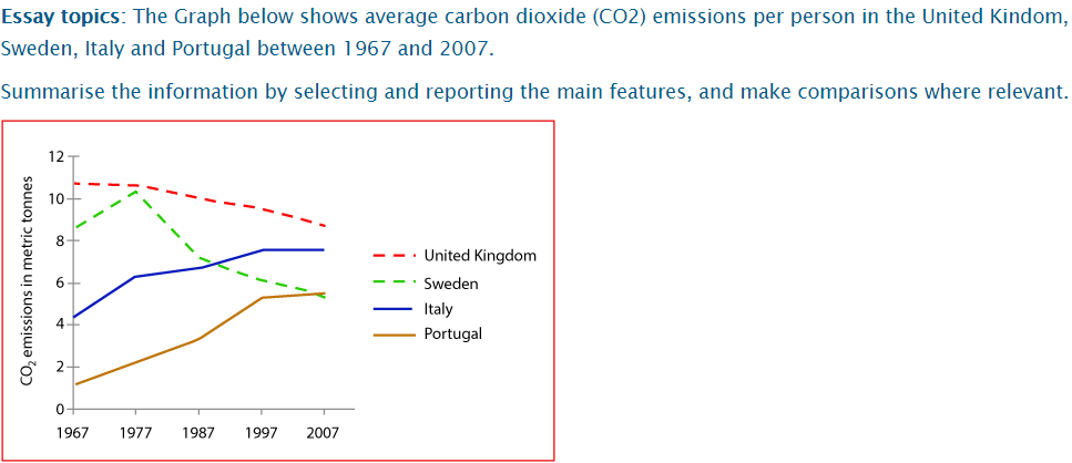
The diagram illustrates the amount of CO2 that has been emitted individually in the UK, Sweden, Italy and Poturgal from 1967 to 2007, a period of 40 years. Overall, the total amount of CO2 emission in Italy and Portugal was increased continuously during the period given, while the number of that in the UK and Sweden was decreased significantly.
It can be seen that Portugal was the country had the least amount of CO2 emission in 1967 with only over 1 metric ton. This figure has risen steadily and remained at about 5 metric tonnes from 1997 to 2007. The same pattern has been witnessed in Italy with only around 4 tonnes in 1967 to almost doubled in 2007 at 8 tonnes.
By contrast, the amount of CO2 in Sweden was about 8 tonnes in 1967 and then has declined sharply to around 5 tonnes though there was a remarkable growth in 1977 at its peak of 10 tonnes. In the Uk, the amount has decreased slightly from about 10 tonnes in 1967 to 9 tonnes in 2007.
co2 emissions per person in europe
The diagram illustrates the amount of CO2 that has been emitted individually in the UK, Sweden, Italy and Poturgal from 1967 to 2007, a period of 40 years. Overall, the total amount of CO2 emission in Italy and Portugal was increased continuously during the period given, while the number of that in the UK and Sweden was decreased significantly.
It can be seen that Portugal was the country had the least amount of CO2 emission in 1967 with only over 1 metric ton. This figure has risen steadily and remained at about 5 metric tonnes from 1997 to 2007. The same pattern has been witnessed in Italy with only around 4 tonnes in 1967 to almost doubled in 2007 at 8 tonnes.
By contrast, the amount of CO2 in Sweden was about 8 tonnes in 1967 and then has declined sharply to around 5 tonnes though there was a remarkable growth in 1977 at its peak of 10 tonnes. In the Uk, the amount has decreased slightly from about 10 tonnes in 1967 to 9 tonnes in 2007.

Task 1
