Tayla Phan
Apr 27, 2020
Writing Feedback / IELTS TASK 1: The chart shows the percentage of renewable energy in total energy supply in Australia [3]
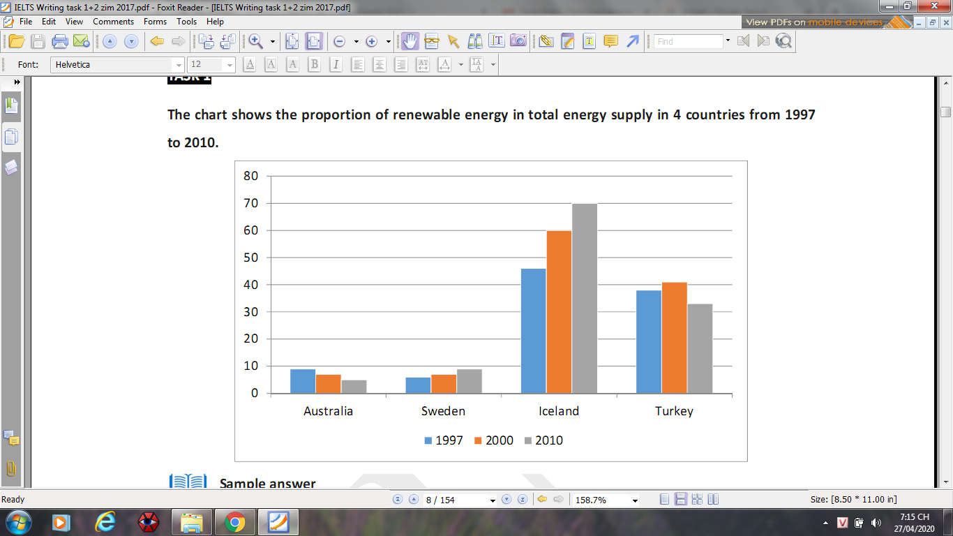
The chart below compares the percentage of renewable energy in total energy supply in Australia, Sweden, Iceland and Turkey over the period of 13 years from 1997 to 2010
Overall, this type of energy are consumed more likely in Iceland than all the other of countries concerned. While the proportion of energy in Sweden and Iceland increased, a reverse pattern was seen for the other countries from 1997 to 20210
The figure of renewable energy used in Iceland mirrored the climb rising from almost half out of total energy produced in 1997 to 60% and finishing at 70% in 2000 and 2010 respectively. Meanwhile, a similar trend was seen to proportion of energy in Sweden which doubled, reaching in nearly 10% in 2010.
Regarding Australia, nearly 10% of total energy was from renewable energy in 1997, against around 5% in 2010. The percentage of energy used in Turkey peaked at just over 40%, following by falling into nearly 30%
Green energy proportion
The chart below compares the percentage of renewable energy in total energy supply in Australia, Sweden, Iceland and Turkey over the period of 13 years from 1997 to 2010
Overall, this type of energy are consumed more likely in Iceland than all the other of countries concerned. While the proportion of energy in Sweden and Iceland increased, a reverse pattern was seen for the other countries from 1997 to 20210
The figure of renewable energy used in Iceland mirrored the climb rising from almost half out of total energy produced in 1997 to 60% and finishing at 70% in 2000 and 2010 respectively. Meanwhile, a similar trend was seen to proportion of energy in Sweden which doubled, reaching in nearly 10% in 2010.
Regarding Australia, nearly 10% of total energy was from renewable energy in 1997, against around 5% in 2010. The percentage of energy used in Turkey peaked at just over 40%, following by falling into nearly 30%

Screenshot2020042.png
