Writing Feedback /
IELTS TASK 1 The line graph illustrates how much waste produced by three companies from 2000 to 2015 [5]
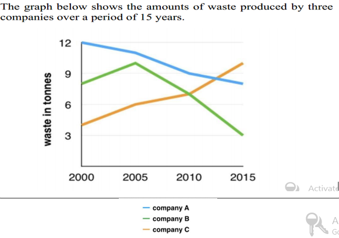
The graph below shows the amounts of waste produced by three companies over a period of 15 years.
The provided line graph illustrates how much waste produced by three companies from 2000 to 2015.
Overall, it is clear that while the amount of waste of com A and B dropped, the figure for com C rose at the end of the period. Furthermore, it can be seen that the period of time from 2000 to 2015 witnessed a significant change in the amount of waste made by com C.
It is noticeable that at the beginning of the period the quantity of waste output by com A was highest, which stood at 12 tonnes, was 1.5 times as much as that of com B and 3 times as much as that of com C.
From that time onwards, the amount of waste produced by com A declined remarkably to 8 tonnes in 2015. Besides, the figure for the waste of com B reached a peak of around 10 tonnes in 2005 before fell to 3 tonnes at the end of the period. In contrast, there was a considerable increase of 6 tonnes (10-4) in that of com C between 2000 and 2015.
I'm practicing IELTS writing. I'm looking forward to receiving your fixing. Thank you so much!

F.png

