Writing Feedback /
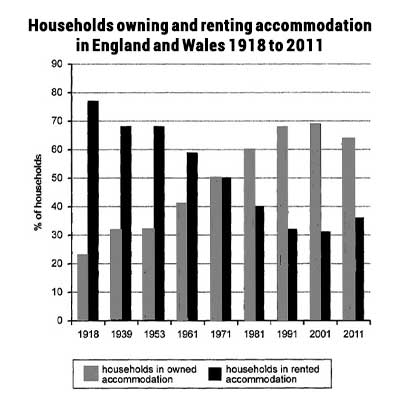
Writing task 1: The chart below shows the percentage of households owned and rented accommodation [3]
households accommodation in England and Wales
The bar chart compares the rate of households owning and renting amenities in England and Wales from 1918 to 2011.
Overall, it can be observed that households marginally favored renting accommodation over owning accommodation between 1918 and 1961. By contrast, the proportion of households in owned accommodation was virtually higher than that in rented accommodation from 1918 till the end of the period shown.
From the beginning, households renting took dominance, with a support rate of nearly 80% in 1991, which was almost 4 times higher than that of households owning. Subsequently, the percentage of households renting gradually went down, but the rise in households owning continued. As a result, the figure for these two types of households had a balanced rate of 50% of each.
Over the following 30 years, the proportion of households owning reached 69% in 2001 after a steady increase. While renting households experienced the opposite trend, reaching around 30% in 2001, which was three times lower than in 1918. There were nearly no changes over the next decade, but there was a minor drop in households owning and a slight rise in households renting.

123456789123456789.j.jpg

