Writing Feedback /
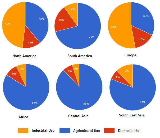
IELTS Task 1: The charts below show the percentage of water used for different purposes in six areas [3]
WATER USAGE diagram
The chart below shows the percentage of water used for different purposes in six areas of the world.Summarise the information by selecting and reporting the main features, and make comparisons where relevant.The diagram displays the percentage of water usage for several objectives in some regions of the world. Overall, the chart is separated into three usages such as industrial use with white color, agricultural use with white color and fill with the line, and domestic use with black color. Most developed countries utilize water for industrial areas. Meanwhile, developing countries use water in farming areas.
Based on the data, I will divide the percentage of water used into three groups. First, the group consists of South America, Central Asia, and Africa, which use water by ranking for farming, domestic, and industrial areas. North America and Europe are in the second group. These two regions used water majority for industrial needs (48% and 53%), agricultural needs (39% and 32%), and only a few percent (13% and 15%) for domestic use. The last group is South East Asia, with 81% spent water for agricultural fields, 12% on industrial, and the last 7% on domestic.
(161 words)
Please help me to evaluate my writing skills, read and comment if it's possible, and please also give a score. Thank you in advance.

percentageofwater.png
