AP17025
Mar 16, 2023
Writing Feedback / [IELTS Writing task 1] Pie chart - Comparative Graphs; time spent on several activities [2]
Hi. I am self-studying for the IELTS exam, I'm trying to get a band 7.0 in writing skills and here is one of my tasks 1 writing, I would be so grateful if I could get feedback on my mistakes and how to improve my writing. Thank you!
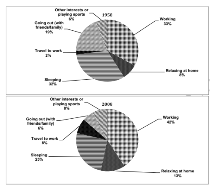
The graph illustrates the alterations in time proportions of workers spent on several activities in a specific country in the two years 1958 and 2008. Overall, people spent most of their hours working, while the time for work and travelling to the workplace, time at home and on other interests increased, people spent less time sleeping and going out.
In 2008, 42% of adults' time was spent at work, 9% more than that in 1958. They also spent 5% more of their time relaxing at home compared to 8% 50 years ago. The time spent commuting had risen up 4 times than the figure of 1958, at 8%. There was also a slight rise of 2% in people's time for hobbies and sports, at 8%.
During that time, labourers spent 7% less time sleeping than 32% in 1958. The time people spent going out with their friends and family significantly declined by about three times with 6% in 2008
Hi. I am self-studying for the IELTS exam, I'm trying to get a band 7.0 in writing skills and here is one of my tasks 1 writing, I would be so grateful if I could get feedback on my mistakes and how to improve my writing. Thank you!
Summarise the information from the pie charts
The graph illustrates the alterations in time proportions of workers spent on several activities in a specific country in the two years 1958 and 2008. Overall, people spent most of their hours working, while the time for work and travelling to the workplace, time at home and on other interests increased, people spent less time sleeping and going out.
In 2008, 42% of adults' time was spent at work, 9% more than that in 1958. They also spent 5% more of their time relaxing at home compared to 8% 50 years ago. The time spent commuting had risen up 4 times than the figure of 1958, at 8%. There was also a slight rise of 2% in people's time for hobbies and sports, at 8%.
During that time, labourers spent 7% less time sleeping than 32% in 1958. The time people spent going out with their friends and family significantly declined by about three times with 6% in 2008

Screenshot2023031.png
Screenshot2023031.png
