Writing Feedback /
IELTS task 1 - line graph aging population [2]
Please correct me if I made any mistakes as I have my ielts exam soon
Thank you so much.
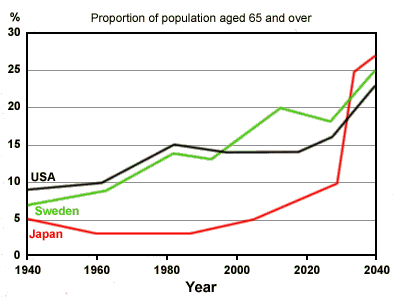
The graph shows the proportion of the population aged 65 and over between 1940 and 2040 in three different countries.The line graph illustrates the proportion of the elderly population (aged 65 and over) from 1940 to 2040 in three different countries: Japan, Sweden and the USA. Overall, the proportion of the elderly population increased in all three countries. It is clear that there were a substantial change in the proportion of the elderly population in Japan over the period.
In 1940, Japan had the lowest elderly population (about 5%) compared to Sweden and the USA, with 7% and 9% respectively. Twenty years later, the elderly population in Japan continually decline and the figure dropped from 5% to 3%. In sharp contrast, the elderly population in two other countries gradually increase; figure for the USA went up from 9% to 10%. Moreover, Sweden had a 2% increase. Since 1960, the elderly population in Japan had a plateau until 1983 approximately. Whereas the corresponding figures for Sweden and the USA have had rose markedly. In 2000, the elderly population in the USA levelled off (around 14%). The elderly population for the two other countries: Japan and Sweden rose steadily, 5% and 14% respectively. By 2020, the population of elderly in Sweden will reach 19%, Japan will reach 9% and the USA will reach 15% as predicted.
By 2040, Japan will have the highest proportion of elderly population - 27%. Sweden will have 25% and the USA will have the lowest proportion of elderly population out of the three countries with about 23%.
To conclude, the proportion of elderly population in all three countries increase more than half over a century.

sampleieltstask1.gif


