sara88fte
Jul 8, 2014
Writing Feedback / IELTS writing - statistics research of population aged 65 and more [3]
please read my text and correct my mistakes,then give a score. thank you.
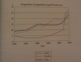
The graph below shows the proportion of the population aged 65 and over between 1940 and 2040 in three different countries.
The line chart indicates the proportion of population aged 65 and over in three different countries in different continents.
It is evident from graph that the old people are increasing by time. In recent decades the most of families prefer to have one child ultimately and some of families have no child, so we have to expect that population will become older. It is obvious in graph that in year 1940, the proportion of population aged 65 and more is about 5 till 8 percent in three countries but it is significantly increased in USA and Sweden, and it is gradually decreased in Japan until 1985, then is increased with a high scope.
In conclusion, the proportion of population aged 65 and over will be about 25 percent in these countries,that is the most amount in recent century. We can result that by decreasing of birthing, the young population will be become lower and lower which it is not a suitable factor for a country.

graph

