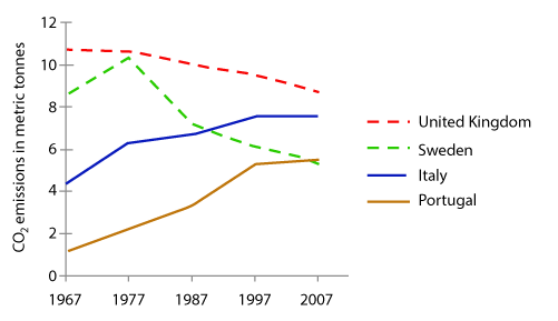
The graph below shows average carbon dioxide (CO2) emissions per person in the United Kingdom, Sweden, Italy and Portugal between 1967 and 2007.
The provided line chart illustrates the average emission of the CO2 per person in four European countries for a 40 year period beginning in 1967.
In detail, the CO2 emission in the United Kingdom and Sweden had decreased. Especially in Sweden, besides the markedly lift between 1967 and 1977, it had dropped from 9 to near 5.5 metric tonnes in 40 years. On the other hand, the graph depicts the steadily growth of CO2 emission in Italy and Portugal. The former grew from 4 to almost 8 metric tonnes and the later was 5 times as much a in 1967 as in 2007.
We can observe from the chart that the CO2 emissions in four countries were quite apart originally, but in the year of 2007, the number became closer and closer. Interestingly, in 2007, the average CO2 emission in the UK was equal to that in Portugal.
average carbon dioxide (CO2) spread in different world areas
The provided line chart illustrates the average emission of the CO2 per person in four European countries for a 40 year period beginning in 1967.
In detail, the CO2 emission in the United Kingdom and Sweden had decreased. Especially in Sweden, besides the markedly lift between 1967 and 1977, it had dropped from 9 to near 5.5 metric tonnes in 40 years. On the other hand, the graph depicts the steadily growth of CO2 emission in Italy and Portugal. The former grew from 4 to almost 8 metric tonnes and the later was 5 times as much a in 1967 as in 2007.
We can observe from the chart that the CO2 emissions in four countries were quite apart originally, but in the year of 2007, the number became closer and closer. Interestingly, in 2007, the average CO2 emission in the UK was equal to that in Portugal.

IELTS_W1CO2_emssion.png
