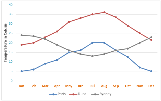
compare the temperatures in Paris, Dubai and Sydney
The line graph below shows the average monthly temperatures in three major cities.
Summarize the information by selecting and reporting the main features, and make comparisons where relevant.
You should write at least 150 words.
The line graph illustrates the break-down of the ordinary temperature of three metropolises in every single month in one year. Generally, the medium temperature in Paris and Dubai between May and August witnessed an upward trend while that of the figure in Sydney saw an experienced trend over that period of time.
In particular, it can be seen from the graph the average temperatures in Paris increase sharply from 5 degrees Celsius in May to 20 degrees Celsius in July and remaining stable between July and August at 20 degrees Celsius before fall back to the previous level in December. Meanwhile, the ordinary temperature in Sydney decrease significantly from approximately 23 degrees Celsius in the first month to around 14 degrees and bottom out at roughly 13 degrees in July. After that, there was a substantial growth to about 24 degrees Celsius in December in Sydney.
In terms of Dubai, as can be observed from the figure the average temperatures in Dubai dramatically raised between approximately 19 degrees Celsius to 35 degrees Celsius in and reach to the peak at more or less 36 degrees Celsius or so in August before falling back to 21 degrees Celsius in December.

graph286averagemon.png
