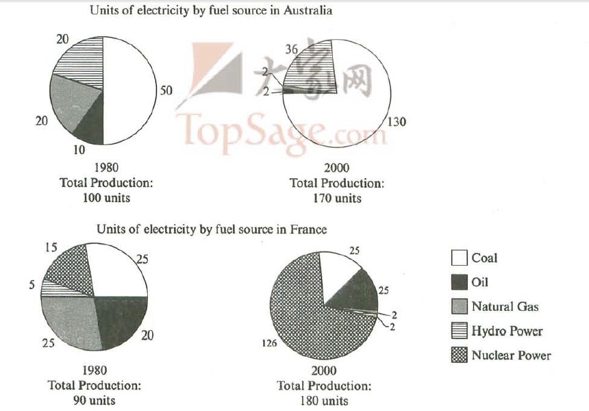
The pie charts below show units of electricity production by fuel source in Australia and France in 1980 and 2000.
Summarise the information by selecting and reporting the main features, and make comparisons where relevant.
The pie charts indicate units of electricity produced by fuel source between the time period of 1980 and 2000 both in Australia and France.
It can be seen that units of electricity by coal was the majority of total production in Australia and grew amazingly, from 50 units in 1980 to 130 units in 2000.While the figure of hydro power saw a increase, rising to 36 units by 2000, those of nature gas and oil in contrast experienced a dramatic drop, reducing by 90% and 80% in 2000 respectively.
The situation is extremely different in France: electricity production was mainly produced by nuclear power during the two decades, increasing by 111 units. While the units of electricity by oil saw a slight rising trend (from 20 units to 25 units), the amounts of natural gas and hydro power fell down obviously, reducing by 23 units and 3 units respectively by 2000. Without any great changes, producing electricity by coal remained 25 units during this period.
Overall, total production of the two countries ascended dramatically, adding by 70 units in Australia and 90 units in France in 2000 respectively. Due to the superiority of local natural resources, Australia tends to use coal, and France prefers nuclear power based on its advance technology in this field.
Your correction will be appreciated, thanks a lot in advance.

For reference
