Unanswered [14] | Urgent [0]
  

Home / Writing Feedback   % width Posts: 3


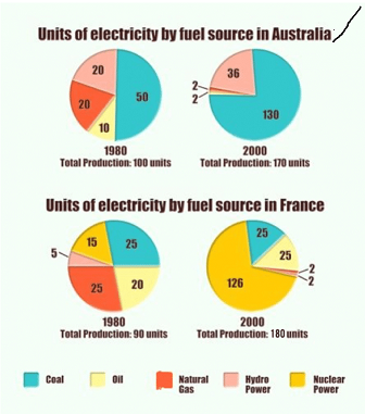
(IELTS WRITING 1) PIE CHART The pie charts below show units of electricity production by fuel source


sherry2345 1 / 1  
Nov 11, 2021   #1

units of electricity production in France and Australia


The pie chart compares fuel source Aus and Fra in terms of their electricity output in units between the year 1980 and 2000.
Overall, there was a significant change in the units of electricity produced by fuel source of two countries shown on the graph. It is clear that the year 2000 witnessed an upward trend in the total production of Fra and Aus.

Looking at the chart in more detail, in 1980, the amount of electricity produced by coal in Australia was double that in France, 50 units compared to 25 units. The electricity output produced by coal in Australia witnessed a significant increase from 50 to 130 units over a period of 20 years. Meanwhile, this figure for that in France remained stable at 25 units.

From 1980 to 2000, the electricity produced by nuclear power surged by 111 units, exceeding all other sources which remained unchanged. This growth made the total production in France doubled, 90 units compared to 180 units.

  • .
Holt  Educational Consultant - / 14,835 4783  
Nov 12, 2021   #2
Please do not abbreviate the names of the countries in the images. Specially when these abbreviations directly affect the clarity of the report presentation.This is highly frowned upon in academic writing. It should never be applied to formal reports such as the task 1 writing requirements.

As there are 4 charts in the presentation, it is incorrect to refer to the image in singular form. These must be described in plural form. Kindly rvivien your grammar lessons in relation to numerical references.

The summary overview is confusing in presentation. The first error is in the image reference. It changed from a pie chart to a graph. The second problem refers to the lack of reference to the trend across the related images. The trend should refer to 4 trends. One per image, creating a trending paragraph in the process.
OP sherry2345 1 / 1  
Nov 24, 2021   #3
@Holt
Thank you so much for your review, I will correct these mistakes.


Home / Writing Feedback / (IELTS WRITING 1) PIE CHART The pie charts below show units of electricity production by fuel source
Writing
Editing Help?
Fill in one of the forms below to get professional help with your assignments:

Graduate Writing / Editing:
GraduateWriter form ◳

Best Essay Service:
CustomPapers form ◳

Excellence in Editing:
Rose Editing ◳

AI-Paper Rewriting:
Robot Rewrite ◳