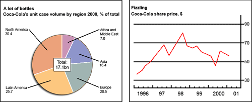
The pie chart describes the sales volume of Coca in five regions, whereas the graph illustrates the changes in the share price of the brand over the period from 1996 to 2000.
Overall, while North America and the Latin America made up the vast majority of Coca consumption, Middle East accounted for the least proportion of all. Over the 1996-2001 period, there was a drastic change in the share price of Coca.
The biggest amount of Coca ( 30.4 percent) went to North America, which was closely followed by Latin America with 25.7 percent of the total. Accordingly, Europe comprised of 20.5 percent of Coca consumed worldwide, while it was 16.5 percent in Asia and a mere 7 percent in the Middle East
Turning to the line graph, the Coca share price, which began in 1996 at about 35 dollars per share, rose dramatically to reach nearly 70 dollars per share in mid-1997 before falling slightly to only 55 dollars per share at the end of the same year. This figure, however, recovered almost at once to peak at 80 dollars per share in mid-1998. After this point, the price experienced a sharp drop and several fluctuations to end the period in 2001 at 55 dollars per share.
Hi Pham, welcome to EssayForum :) Before moving on to my feedback, I would like to say that you need to upload the picture/chart/diagram when you post IELTS writing task 1 essay practice. By uploading the picture, it will ease members and contributors in this forum to further read and check your analysis of the chart/picture/diagram given. Moreover, you are also suggested to give at least 1 space (1 enter) for each paragraph to ease the reader in checking your essay.
1st paragraph:
- The pie chart describes the sales volume of Coca-Cola in five regions, whereas the graph ...
2nd paragraph:
- Overall, while North America and the Latin America made up the vast majority of Coca-Cola consumption, Middle East accounted for the least proportion of all. Over the 1996-20015-year period, there was a drastic change in the share price of Coca-Cola .
It is better to combine those paragraphs into 1 strong and solid introduction paragraph rather than making incomplete paragraph like that. You need to complete the way that you present the information in the overview / introduction of your essay. You accidentally created only 1 sentence in what was otherwise a very strong start to your essay. Your mistake was compressing the information into the 1 sentence you presented. Format your opening statement into at least three sentences this way:
The pie chart describes... (1st sentence)
Overall, while North America... (2nd sentence)
Over the 1996-2001 period,... (3rd sentence)
As you can see, strong introduction and overview is one of the requirements to reach band 6 or above. The above suggestions are related to that matter. I hope you can follow through the feedback. Good luck for the next practice :)
Hi Nguyen, as this is your first post, I will not drill you too much on posting the graph or the diagram, however, note that this is very important, specially in the part of us, reviewers, simply because, without the graph we will not be able to figure out where the information came from, we don't have any basis of the analysis that we are reviewing, not only that, with the graph, you can be sure that we are giving you the most accurate review on your analysis and we will be able t provide you with your much needed feedback.
Moving on, as our subject is "Coca Cola", as much as I want to encourage you in substituting the subject with "it", or any other substitutions, mind that you cannot substitute it with "Coca", as this can mean differently from the subject. Coca, can be chocolate or other ingredients that make medicine, but not Coca Cola, what I suggest that you use is the word, "soda", because it is a general term for beverage.
Overall, the analysis is written in a manner that it is comprehensive, however, as I said, there will not be any basis for this analysis, as the graph is missing. You can always add it when you write after this review, so we can get back to you for further analysis.
Guys, I'm sorry. I have posted the charts for my writing task 1. Thank you so much for your help!

141400_1_o.gif
Hi Nguyen, don't worry about your post, as we said, it's your first post so you get a free pass, :)
Now, for future writing reference, specially when it's an analysis, make sure that the analysis follows a uniform format, from the unit of measurement, like if you have percentage (%), make sure that you use a symbol right next to the number or the figure of the sentence. The figure that is extracted from the graph or diagram should also be very accurate, as much as possible, never add or delete ay information illustrated in the diagram. This is an analysis and it is very crucial to be up to the tiny bit of information.
Furthermore, analyzing the data is understanding it first, once you have understood the diagram, it will be very easy for you to write your analysis.
Moreover, the overall analysis is very close to the diagram you provided and what I could say is for you to be consistent with the information and this should create a strong analysis.

