First of all i would like to say THANK YOU for all the people who gave valuable feedback to my previous essay and for the warm welcome.
To this report I am so grateful if you can rate this from a scale of 1 to 9.
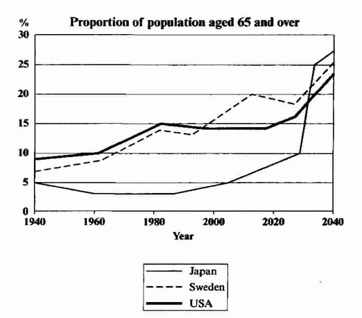
Prompt - The graph below shows the proportion of the population aged 65 and over between 1940 and 2040 in three different countries.
The graph illustrates the quantity of the population aged 65 and over between 1940 to the present as well as to the future up to 2040 in three different nations.
It is evident that in 1940 the aged population over 65 was below 10 percent in all three countries while USA depicted the highest value of 9%. After that the proportions of USA and Sweden increased to a peak in 1980, where USA represented 15% while Sweden was also managed to come near to that point. During this period Japan showed a slight draw back, by keeping the same position between three countries.
However the chart also predicts the proportions in 2040 which are contradictory to the past. According to that Japan bears the highest amount over 25% while Sweden and USA are in that order respectively. The transition of Sweden over USA showed before 2000, and it is predicted to be the same till 2040. In contrast Japan shows a slow increase until 2030, when the values starts to rocket to the highest point in 2040.

6a0120a5bb05d8970c01.png
