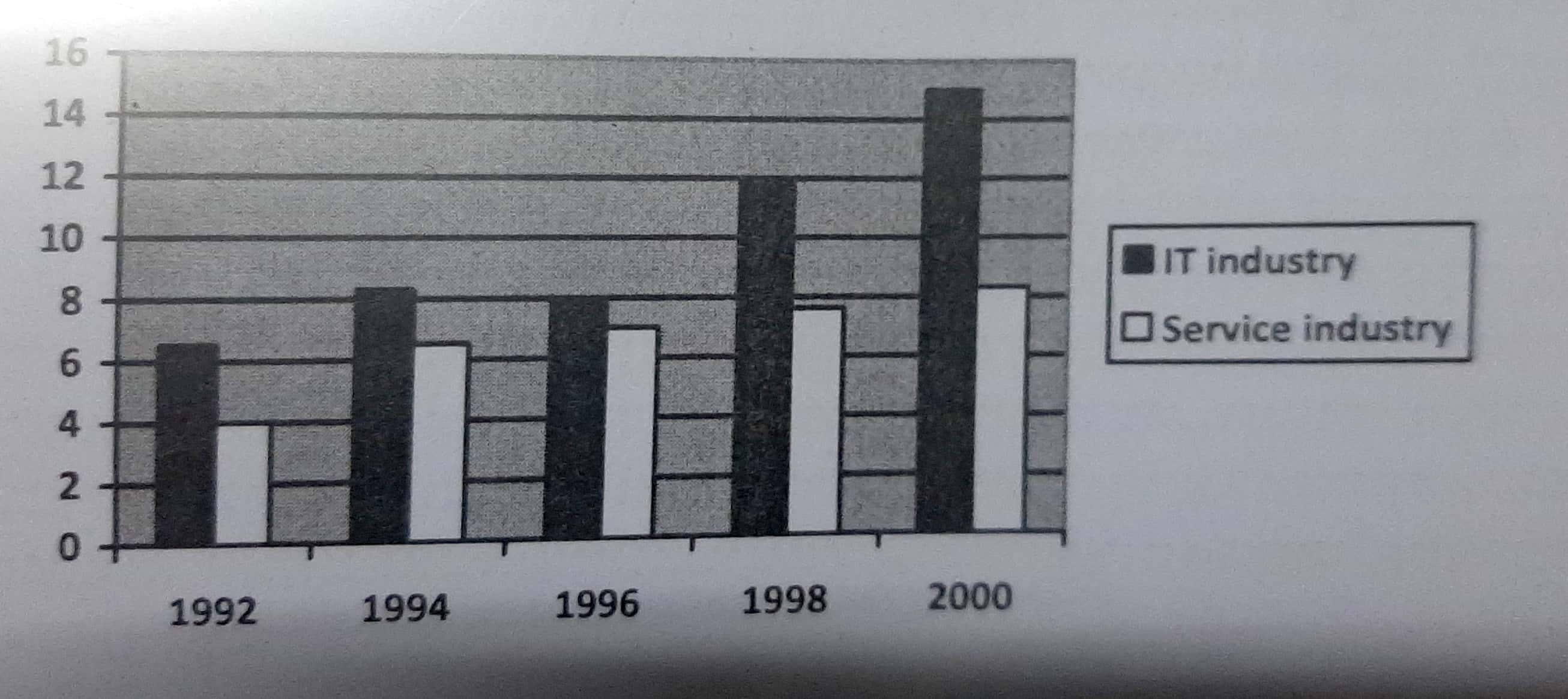
The bar chart above compares the percentage of IT industry and Service industry which are the constituents of Gross Domestic Product (GDP) of UK from 1992 to 2000.
Overall, it is clearly considered from the chart that IT industry was continuously a component which had more contribution to GDP of UK from 1992 to 2000. Meanwhile, despite being less influential, Service industry experienced a rather stable development.
In the first four years, it is easily seen a small fluctuation of IT industry. The percentage of this field witnessed a stable increase from 6.7% to 8.6% from 1992 to 1994 before hitting a very slight fall by about 0.6% to 8%. Comparison with oscillation of IT industry, Service industry saw a growth steadily to 7% in 1996 even though it is recorded this figure just arrived at 4% in 1992.
To IT industry, the next two years is the time of significant bloom which are worth mentioning. Although the two areas were similar in the terms of increase, IT industry still took the strong impression when reaching the highest point of 15% in 2000. Service industry, at the same time, continued contributing to GDP presented by that the proportion of this group rose gradually from 7.9% to 8.2%.

CamScanner0917202.jpg
