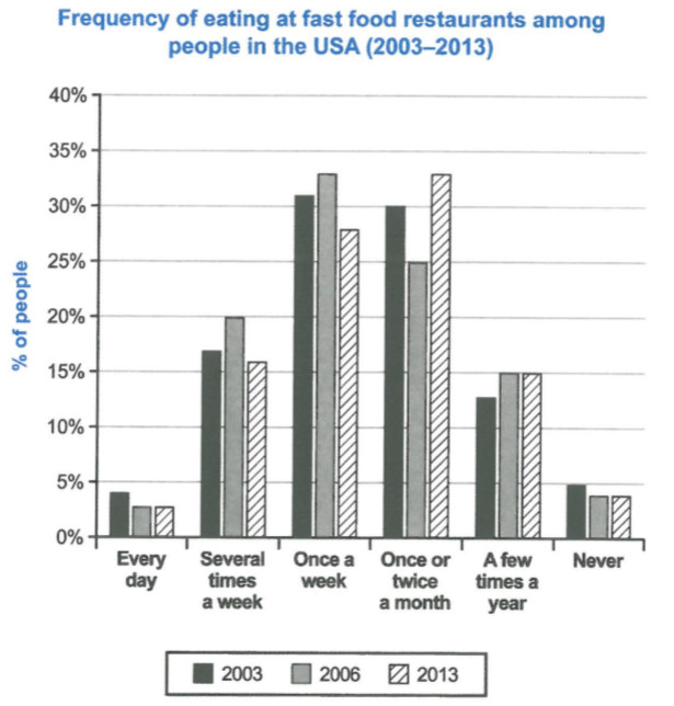
The chart below shows how frequently people in the USA ate in fast food restaurants between 2003 and 2013.
Summarise the information by selecting and reporting the main features, and make comparisons where relevant.
The graph compares how often USA citizens eat in fast food restaurants in 2003, 2006 and 2013. It categorizes the results in 6 states; which are Every Day, Several Time a Week, Once a Week, Once or Twice a month, a Few Time a Year, and Never. In this report, we will discuss the findings in more details by presenting the main trends in the graph.
Under 5% of USA people either never ate in fast food restaurant or ate every day, although the numbers are decreasing gradually from 2003 to 2013. 17% of people ate fast food several times a week in 2003, this number increased to 20% in 2006 and rapidly decreased to 16% in in 2013. Just over 30% of people were using fas food at least once a week in 2003, and the figures gradually went up to around 33% in 2006 and significantly went down to 28% in 2013. In addition, in 2003, 30% of citizens ate fast food once or twice a month which had significant decrease to 25% in 2006 and surprisingly grows to 33% in 2013. In the last category, there were 13% of people who ate fast food a few times a year, and this number gradually increased to 15% in 2006 and remained steady till 2013.
It shows that in general, the number of people who ate fast food is decreasing in 3 categories over the mentioned years, except for "Once or Twice a Month" which raised to 33% and "a Few Times a Year" plus "Never" which remained steady.
(229 Words)
One additional question I have is about the number of words that I used. Are they too much? Do I get a deduction in grade if something like this happens in IELTS exam?

figure.jpg
