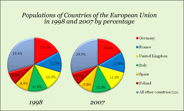
The charts show the relative size of populations of countries of the European Union in both 1998 and 2007.
Summarize the information by selecting and reporting the main features, and make comparisons where relevant.
The pie charts illustrate the population spread across states of the European Union in the year 1998 and 2007. It is noteworthy that 21 countries are grouped as a whole for analysis. In this essay, I will extract the essential elements of these graphs to make insightful comparisons.
Overall, the figures demonstrate the fragmented nature of the population distribution in the EU, without any segment accounting for above three tenths of Europeans in either year. Their share only saw minimum changes in 2007. Likewise, the ranking in the relative size of population turned out to remain the same.
Among the nations named, Germany continued to have the largest percentage of the total population, at 16.6% in 2007, in spite of a marginal decline from 17.1% in 1998. France and Britain retained the second and third spot, each accommodating 12.8% and 12.3% of Europeans in 2007, up from 12.5% and 12.2% in 1998. They were followed by Italy, where 11.9% of people lived in 2007, almost the same percentage as 11.8% in 1998.
Farther down the list came Spain and Poland. Their citizens represented 8.3% and 8.0% of Europeans in 1998, and 9.0% and 7.7% in 2007. With regard to the 21-country group, their people composed 29.7% in 2007, a negligible rise from 29.4% in 1998.
213 words. 35 minutes (efficiency will be improved)
I arranged my presentation in order of population ranking, and chose a replacement for "distill". Hope it works.
Please feel free to pick out errors you see, no matter how minimum. I would more appreciate it if your score the essay.
Summarize the information by selecting and reporting the main features, and make comparisons where relevant.
population spread across EU states
The pie charts illustrate the population spread across states of the European Union in the year 1998 and 2007. It is noteworthy that 21 countries are grouped as a whole for analysis. In this essay, I will extract the essential elements of these graphs to make insightful comparisons.
Overall, the figures demonstrate the fragmented nature of the population distribution in the EU, without any segment accounting for above three tenths of Europeans in either year. Their share only saw minimum changes in 2007. Likewise, the ranking in the relative size of population turned out to remain the same.
Among the nations named, Germany continued to have the largest percentage of the total population, at 16.6% in 2007, in spite of a marginal decline from 17.1% in 1998. France and Britain retained the second and third spot, each accommodating 12.8% and 12.3% of Europeans in 2007, up from 12.5% and 12.2% in 1998. They were followed by Italy, where 11.9% of people lived in 2007, almost the same percentage as 11.8% in 1998.
Farther down the list came Spain and Poland. Their citizens represented 8.3% and 8.0% of Europeans in 1998, and 9.0% and 7.7% in 2007. With regard to the 21-country group, their people composed 29.7% in 2007, a negligible rise from 29.4% in 1998.
213 words. 35 minutes (efficiency will be improved)
I arranged my presentation in order of population ranking, and chose a replacement for "distill". Hope it works.
Please feel free to pick out errors you see, no matter how minimum. I would more appreciate it if your score the essay.

QQez201710281537.png
