Unanswered [2] | Urgent [0]
  

Home / Writing Feedback   % width   Posts: 4


IELTS TASK 1 - The diagram illustrate immigration into the United States from 1850 to 1930


liliaeat 1 / 3  
Sep 26, 2020   #1

information about immigration to the United States


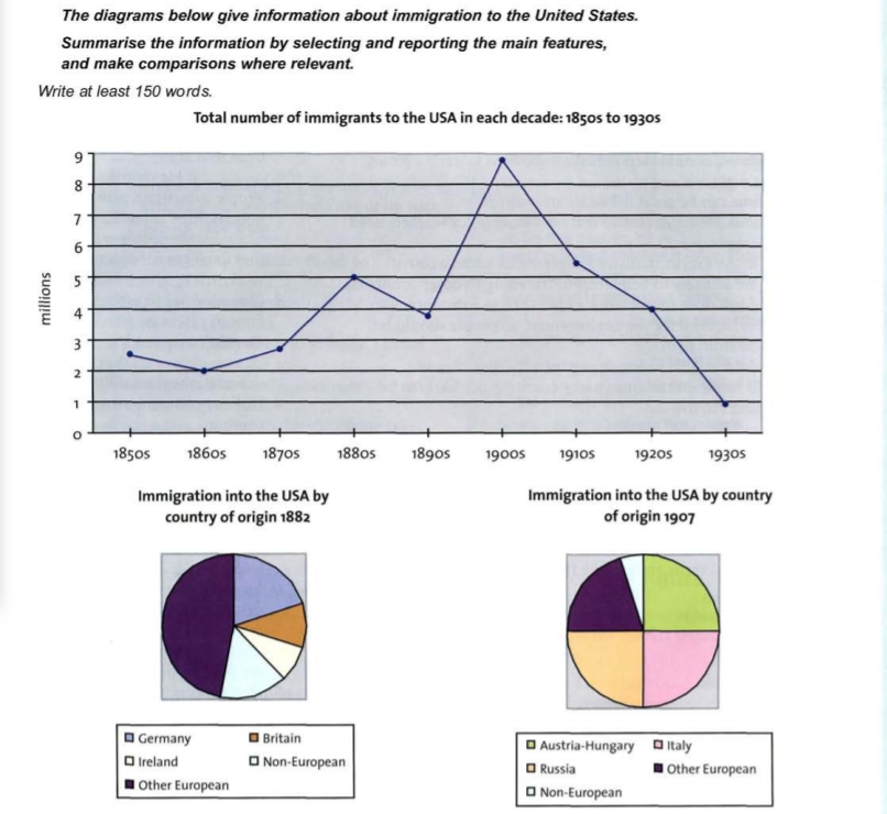
The data illustrate that migration to the United State from 1850 to 1930.

First of all, there was a fluctuate from 1850 to 1870, and then increase dramatically from 1870 to 1880 and from 1890 to 1990. What is more it reached a peak in 1990.

Secondly, it declined steadily from 1880 to 1890 and from 1910 to 1920. Furthermore, it decreased sharply from 1900 to 1910 and from 1920 to 1930.

Thirdly, in 1882 Other European were the largest country to immigrate into the USA, and then Non-European were the smallest part of immigration into the USA. In addition Germany and Ireland were almost in the same proportion.

Finally, in 1907 Austria-Hungary, Italy and Russia were three proportions in the same percentage. In fact there were the majority of immigration to the USA. In addition, Other European were in the forth which immigrated to the USA fell drastically. Last, Non-European remained the smallest one.

  • T1.jpg


Holt  Educational Consultant - / 15371  
Sep 27, 2020   #2
You did not identify the type of images provided, which became the source of your data. It is important to identify the type of image prior to giving the information because the reader needs to create a mental picture of the data indicated. The source of information should also signify the type of information provided in each image. Your summary overview is therefore incomplete. It failed to identify the 3 images provided and what information is provided in each image, which would be the basis of your comparison information within your reporting essay.

You should also show a uniformity in your paragraph presentations, the most minimum number of sentences would be 3, with a maximum of 5. Without it, you are not properly reporting the essay information. You are also lowering your GRA score by relying in long sentences instead of analytical sentences within the presentation.
LadyOfClockwork 30 / 100  
Sep 28, 2020   #3
Hi, I think your analysis of the line graph is a bit confusing. Below in my thought. I hope it's helpful.

-- No more than 3 million people immigrated to America ever decade from the 1850s to the 1870s, but the figure swung up to a record high of near 9 million in the 1900s.

I think that it would be better to list information in time sequence.
OP liliaeat 1 / 3  
Sep 29, 2020   #4
@LadyOfClockwork
@Holt
thank you yours feedback it is very helpful:)


Home / Writing Feedback / IELTS TASK 1 - The diagram illustrate immigration into the United States from 1850 to 1930
Do You Need
Academic Writing
or Editing Help?
Fill out one of these forms:

Graduate Writing / Editing:
GraduateWriter form ◳

Best Essay Service:
CustomPapers form ◳

Excellence in Editing:
Rose Editing ◳

AI-Paper Rewriting:
Robot Rewrite ◳

Academic AI Writer:
Custom AI Writer ◳